Worst Web Sites 2009
![]() Ugliest / Worst Business Web Sites of 2009, But You Can Learn Something From Them
Ugliest / Worst Business Web Sites of 2009, But You Can Learn Something From Them
![]() Ugliest / Worst Business Web Sites of 2009
Ugliest / Worst Business Web Sites of 2009
![]() Ugliest / Worst Business Web Sites to Navigate in 2009
Ugliest / Worst Business Web Sites to Navigate in 2009
![]() Ugliest / Worst Web Sites of 2009: Honorary Winners
Ugliest / Worst Web Sites of 2009: Honorary Winners
![]() Ugliest / Worst Over The Top Web Sites of 2009
Ugliest / Worst Over The Top Web Sites of 2009
![]() Ugliest / Worst Non-Profit Web Sites of 2009
Ugliest / Worst Non-Profit Web Sites of 2009
Gorgeous Websites From The Late 90's To Inspire You — If You Have No Taste
Worst Web Sites 2008
Worst Web Sites 2007
Worst Web Sites 2006
More Bad Web Design
Daily Sucker
Daily Examples of Bad Web Design
Web Redesign Checklists
Checklist 1
149 Ways to Kill Your Web Site
Checklist 2
82 Ways to Ruin Your Web Site
Miscellaneous
![]() Back to The Worst Web Design Techniques Featured on Web Pages That Suck in 2005
Back to The Worst Web Design Techniques Featured on Web Pages That Suck in 2005
The Germans Can't Dance When They've Eaten Too Much Wiener Schnitzel Mystery Meat Award
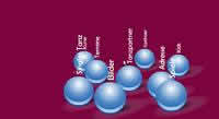
My original comments: I originally thought the site was going to be a bank. Once inside, the designer seems to have taken the idea of "dancing" a little too literally when the navigation was designed. It doesn't help that lady who runs the school also sells insurance: one of the links takes you to the insurance company web site for no obvious reason.
The vertical type on the dancing navigation that loudly beeps at you when you mouse over it is over the top.
Reader comments: Interestingly, I note from the source text, that this actually is a Frontpage site. Does Frontpage now do Flash?
The colour scheme makes my eyes water. That bouncing marquee is the last word in kitsch, seriously. Oh, and not all the of pages have a title. The main navigation page is called "Neue Seite 1", which is German for "New Page 1".
I like the way they mix in some English with their German. One of the dancing balls is labeled "Kids" whereas most of those balls have German labels. Kids in German is Kinder. Click on the Kids ball and you get a flash Under Construction page (yes, the words "Under Construction" are in English).
As for the color scheme, red + yellow = psychedelic.
Gott im Himmel !!
Ve have vays of making you click!
BTW, some of the daily suckers should come with a nausea warning.
I often wonder what possess people to make those animated gifs. Really, a dancing hillbilly alligator? Do you just get up in the morning and think, "Hey, you know what web design really needs? A DANCING HILLBILLY ALLIGATOR! All the top companies will use it!"
![]() Back to The Worst Web Design Techniques Featured on Web Pages That Suck in 2005
Back to The Worst Web Design Techniques Featured on Web Pages That Suck in 2005