The Worst Web Sites of 2007 #11-20

Web design is an art. Great web design occurs when design and content are seamless and you don't notice its greatness. With great web design, it's easy to find the information you need. The content makes you want to return again and again and, most importantly, great design gives credibility to the company/organization.
Unfortunately, 2007 was a great year for bad web design. I assume you've checked out the 10 Worst Web Sites of 2007, so here are the next 10 bad designs of 2007 that appeared on Web Pages That Suck.
It's important to note that the worst web pages are not simply car wrecks on the Information Highway. Many of the sites that are featured on Web Pages That Suck have only one or just a few glaring faults.
Anybody can throw up a site like Video Sonic Labs. Yes, such sites are occasionally featured here, but you gain more understanding by seeing sites where the solution is more than "Let's nuke the site and start over from scratch." (Apologies to my readers in Japan.)
The following sites comprise the runner up group of the worst web sites that appeared on Web Pages That Suck during 2007.
Note: It's been eight years since this list was posted. Some/Many/Most/All of these web sites have probably been fixed. If you find any, let me know which sites don't match up.
20. Restaurant Guide Atlanta

They may be doing something right, but it looks like they're doing a lot wrong. Personally, I'm amazed s/he found the Guide. My eyes went over to the right side looking for information. The top-left corner should be reserved for the logo, but that's where the link is for the Guide.
Submitter's comments: I am preparing for a trip to Atlanta next week. Some, but not all, of our meals are provided. So I wanted to find a Mediterranean restaurant close to our hotel, if possible. I used Google [restaurant guide Atlanta] and this site popped up at the top of the heap.
I did find the list of what I was looking for pretty quickly, to their credit. I clicked on "Cuisine Guide," where the categories are arranged alphabetically, sort of. They list 12,000 restaurants, and have had over 8 million visitors so they must be doing something right.
Vincent Flanders' comments: The Web Page Speed Report says the Cuisine Guide page weighs in at over 3.6Mb! It also lists a lot of other structural mistakes.
There's so much to hate about the Cuisine Guide. I'll start with the background image, go to the smallness of the text and end up with underscored text that should be links, but isn't. There's so much more, but I'll let you comment.
19. Freemap.com

Nothing says "this sucks" better than animated globes from 1996. One of these days they'll disappear and I'll get all misty-eyed and nostalgic about them...No I won't. I won't miss trailing cursors, even though the one here may be the longest trailing cursor in web history.
Submitter's comments: These are nice people, I'm sure, and I used to buy maps from them when they had a brick-&-mortar store in downtown St. Paul Unfortunately, their online presence is just horrifying: a bunch of cells of all different sizes, left-right scrolling, animated globes, and no clues to navigation whatsoever, just a bunch of things stuck randomly on a page.
Vincent Flanders' comments: I would have thought it was OK for a site that sells globes to use one. I was wrong.
Here's another example of a local company with a good reputation totally destroying their credibility with such a lousy design. Aren't there any web designers in St. Paul? Does this company know they can buy a web page template?
18. CPA Infrastructure
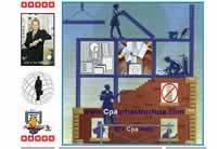
This site reminds me of a story I tell about Ampy, one of my favorite former co-workers. Back in 1995, I had to surf the web to find sites to recommend to our clients and I ran across what I thought was the most horrific site on the web. Horrific in the sense of content, not design. I showed the site to Ampy and he was properly horrified, but then I uttered my immortal phrase, "It can always get worse." Two days later, I found something even worse.
It can always get worse.
Submitter's comments: Vincent, you and I go back what 8, maybe 9 years? During that time frame, I've submitted to you plenty-o-daily suckers — each demonstrating one more of the crappy, crufty, kitschy "Bozo no-no's" you warn against in your books, videos and lectures (yes folks, that's a shameless plug on behalf of Mr. Flanders).
However early this morning while surfing about for good examples of really bad church clip art, I came across this site for accountants — which I suspect was itself designed by an accountant; such persons being notoriously not-so-fluent in endeavors of any aesthetic impact.
There's so much going wrong with this site that to enumerate all the mistakes would take the creation of a small database-driven tracker (DDT) to save, organize and display (SOD) them in a fashion that is coherent, rapid, accessible and printable (CRAP).
Anyway, it is with some eye-numbing excitement coupled with an animation-induced epileptic seizure that I give you the CPA Infrastructure Home Page. Which IMHO, is the worst web site on the web at this point in the web's short history — one which has me hopeful that the only way to go from here is up.
Vincent Flanders' comments: To me, the most puzzling aspect of web design is Mistake #5 in my article, Biggest Mistakes in Web Design 1995-2015 — "#6. Have you ever seen another web site? Really? Doesn't look like it. This site looks like someone has never seen another accounting web site.
As far as clip art, there's no excuse for not going to places like IStockPhoto and the dozens of other free or inexpensive sites to get clipart. It's like $1 - $2 an image.
17. International Home Fashions

The web site of International Home Fashions…or is it "International Ho?" Wait a minute; didn't Don Imus get in trouble for saying that? I guess that’s why it’s called Shockwave.
This is pretty darn funny. This is the kind of mistake that just makes you look stupid and it's hard to fix because the "typo" was made in Flash.
16. Fiber Optic Products

The opening sound also pops up on at least one other page, which scares the heck out of me. This site uses almost every bad web design technique that shows up in my article Does My Web Site Suck? Checklist 1 - Fatal Mistakes.
OK, OK. It doesn't make all 149 mistakes — it just feels that way.
Submitter's comments: Have at it. Beware the opening page's short sound.
Vincent Flanders' comments: I'm a marketing weasel. We like shiny things. I want this t-shirt in the worst possible way, but there are two huge problems:
-
The site looks totally unprofessional and I have a problem with giving my credit card number to any site that looks like this.
-
I'm huge (not in that way, unfortunately). They don't carry t-shirts in XX-large.
This site is also really good example of Mistake #6 from Biggest Mistakes in Web Design 1995-2015 — "Have you ever seen another web site? Really? Doesn't look like it." I call this type of design the "I haven't taken my antipsychotics in a while school of web design."
I want that t-shirt.
#15 Qssis Banquet Halls (Flash Version)

I don’t know about you, but I don’t like being scared by an explosion when I enter a site. I’ve written about using music on your web site before — or should I say "not" using music on your web site unless you're in the music business.
I also find it a little bit weird that the music on the home page is Billy Idol’s White Wedding. I like a lot of Billy’s music, but it doesn’t quite seem appropriate. Then again, maybe Qssis' audience looks like Mr. Idol.
Anyway, the site is a trip.
Submitter’s comments: I found this web site a little while ago and it is so bad, that I love it. From the music and exploding intro, to the poorly Photoshopped light beams coming in through the banquet's windows in their photos section. Fantastic.
Vincent Flanders' comments: Ironically, the video page uses Carmina Burana, which was mentioned in my article about using music on web sites. You have to check this page out. A bride and groom ride a motorcycle through flames and smoke to the background music of Carmina Burana.
14. Gamequarium
Submitter's comments: I don't know if this site should be in the top 20, but is definitely bad. The site is supposed to be for teachers and elementary school students, but I don't know how anyone could get past the home page because it looks so bad.
Vincent Flanders' comments: I certainly couldn't get past the home page.
The following is boilerplate commentary for this type of site because these sites come up so often:
This is a really good example of Mistake #6 from Biggest Mistakes in Web Design 1995-2015 — "Have you ever seen another web site? Really? Doesn't look like it." I call this type of design the "I haven't taken my antipsychotics in a while school of web design."
13. Hong Kong Young Design Talent Awards

Submitter’s comments: I think you will love that the “English version” text moves around the screen when you mouse over. Also, the left menu is sideways.
Vincent Flanders’ comments: I also like the fact the TITLE tag is “ydta.” Yeah, the search engines are going to know it stands for “Young Design Talent Awards.” Sure.
Other comments: It took me a couple of minutes to even realize the gray bars on the left were the navigation. I just thought it was some artsy-fartsy white space filler.
12. 1001 Pens
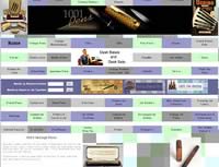
Vincent's comments: It's pretty horrible. I don't think I've ever seen such horrid navigation that was labeled so clearly.
Other comments #1: Clear labels are no help. You can't find anything even after you click on the links.
Other comments #2: Click the links and nothing seems to change. Scrolled down and found out below the fold has changed. How do they expect to sell anything?
11. MH Manufacturing

I'm really tired of the 1996 globe and I hate the menus that follow you around.
Submitter's comments: I came across this manufacturing web site. You don't have to go far to find several issues with their web design:
- It has "Welcome to..." on their web site.
- It has a poor contrast. i.e., white text on the black background.
- The audio/music plays automatically.
- The navigation menu follows you when you scroll.
To make matters worse, this web site. automatically refreshes your browser...every 20 to 25 seconds on their home page!! Luckily, they don't do that on other navigational links.