Gorgeous Websites From The Late 1990's To Inspire You — If You Have No Taste

Recently there was an article about how popular web sites looked in the late 1990's. While it's interesting to see what Adobe or Apple looked liked back then, there isn't much you can learn from these sites. I'm also not sure how much inspiration you can get from looking at any kind of good examples.
On the other hand, you can really learn from and be inspired by web sites that are featured on Web Pages That Suck — especially those from the late 90's. At the very least, you can learn to take the other direction. More importantly, you'll feel good about your design skills because nobody ever looked at the examples on Web Pages That Suck and said, "I'm a horrible designer because I can't create these kinds of web sites." When you leave this site, you'll feel good about your design skills.
Southwest Airlines
From April 1998

For years, I never knew the academic word for this type of bad web design. I originally called it "MYSTifying navigation," but the proper term is "Skeuomorphic." This technique was stupid in 1998 and there are still sites using this same technique today. Heck, a lot of Apple's own iPhone apps used skeuomorphism. With iOS 7, most skeuomorphic examples have allegedly been eliminated. I wish I could say the same for the web.
Admissions Department University of Missouri, Rolla
From February 2000

Skeuomorphism sucks, but what's worse? Star Trek Skeuomorphism.
WTF? This is the admissions department for a college not some basement-dwelling Trekkie pretending he's Captain Kirk. WTF? The school changed their name to Missouri University of Science and Technology. Fortunately, they changed this page. Take a look at their current page — it makes sense.
Watch the YouTube video.
Watch the SmugMug video version.
View the full-size screen capture.
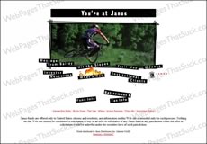
Janus
From April 1998

It's a great idea to make your customers think that their broker is riding a $4,000 bike instead of managing his accounts. It will inspire them — to take their business elsewhere. From 1998.
Scene-Clean Version 1
From July 1998.

One of the most amazing and inspirational web sites of the 20th Century. God, how I miss these guys. How I miss the theme from Mission Impossible, the animated email icon, and the banner that says:
LOVE FOR SALE $50,000 gets you a whole lotta love.
$50,000 damn well better get me a whole lot of love.
Watch the YouTube video version.
Watch the SmugMug video version.
View the full-size screen capture.
Governor of Oklahoma
From April 1998

I was being interviewed by a radio station in Oklahoma City back in 1998 and I was asked to give an example of an ugly web site. Guess which site I suggested? Ironically, the creator of the site disagreed. I'm willing to bet serious money s/he now agrees with me.
Scene-Clean Version 2.0
From April 1999

Upset that they were the Daily Sucker instead of a High Five site, the folks at Scene-Clean came up with a new web design paradigm they thought would make their site a classic — animated skulls.
Amazon.Com
From April 1999

The inspiration for this April 1999 page might have been white men parading around at night in their white robes. The inspirational part? Barry White's teeth sparkle.
Advanced Tactical Firearms
From April 1999.

When I received the email suggesting this site as a candidate for The Daily Sucker, there was a P.S. that read, "Make sure you turn up the sound on your computer." Like an idiot, I turned up the volume. Oops. I was inspired to jump under my desk.
Watch the YouTube video.
Watch the SmugMug video version.
View the full-size screen capture.
U.S. Army Corps of Engineers
From March 1999.

If the Army Corps of Engineers builds web sites like this one, then it's only logical that you should be worried about anything else they build.
Watch the YouTube video.
Watch the SmugMug video version.
View the full-size screen capture.
OXO
From September 1999

I love OXO products and have lots of them in my house. The folks at OXO really, really loved this design. They were really, really wrong.