The Worst Web Sites of 2007 #21-30
HOLY MOTHER OF GOD! The year 2007 was a good year for bad web design. I assume you've checked out the 10 Worst Web Sites of 2007, and the Worst Web Sites of 2007 #11-20, so here are the last of the 30 worst web page designs of 2007 that appeared on Web Pages That Suck.
It's important to note that the worst web pages are not simply car wrecks on the Information Highway. Many of the sites that are featured on Web Pages That Suck have only one or just a few glaring faults.
Anybody can throw up a site like Video Sonic Labs. Yes, such sites are occasionally featured here, but you gain more understanding by seeing sites where the solution is more than "Let's nuke the site and start over from scratch." (Apologies to my readers in Japan.)
Note: It's been five years since this list was posted. Some/Many/Most/All of these web sites have probably been fixed or the companies aren't there. If you find any, let me know which sites don't match up.
The following sites comprise the 2nd runner up group of the worst web sites that appeared on Web Pages That Suck during 2007.
30. Marshall & Ogletree

Submitter's comments: I just ran across this horrible site for Marshall & Ogletree, builders of digital church organs.
Some points:
- It has an absolutely useless splash page.
- All text on the homepage is hidden in graphics...
- ...which are repeating themselves.
- And do I still need to say that they use frames for their navigation?
Vincent Flanders' comments: I can't believe that in the last month I've run into two web sites that use graphics for the complete web page. What is going on here? Is somebody taken the "design your site in Photoshop" concept and forgotten that HTML is an important part of the page?
29. UMX Lanyard Factory
Submitter's comments: Here is a company I came across. WOW!
Vincent' Flanders' comments: Wow! The page weighs in at 1,085,477 bytes and only 99,012 of them are text — very ugly text.
I just look at the page, shake my head, and mutter "Damn. Somebody approved this site."
The following is boilerplate for this type of site:
This is a really good example of Mistake #6 from Biggest Mistakes in Web Design 1995-2015 — "Have you ever seen another web site? Really? Doesn't look like it." I call this type of design the "I haven't taken my antipsychotics in a while school of web design."
28. Fargo Homes
Submitter's comments: Hello Vincent, I have found, sigh…, another contender that has a horrible web design.
The web site is just ugly. Long pages, large images, you name it. When you click on their links, the pain does not stop. It leads to more madness! Not only their links is uglier, guess what they have: FRAMES! I have a bad feeling that this web site could be one of the worst real estate web sites that I have ever seen.
To sum things up, it is just a huge (Document Size: 344KB) and ugly (bad web design) web site.
Vincent Flanders' comments: With the housing industry having such horrible times, now is NOT the time for any company in the industry to have a sucky web site.
Initially, the site looks like it's moderately sucky; however, as you click links or scroll the page it gets much, much worse. I just look at the page, shake my head, and mutter “Damn. Somebody approved this site.”
This is a really good example of Mistake #5 from Biggest Mistakes in Web Design 1995-2015 — “Have you ever seen another web site? Really? Doesn't look like it.” I call this type of design the “I haven't taken my antipsychotics in a while school of web design
27. Seekonk Police Department

Submitter's comments: Blinky text (in Firefox), marquees, random justification, tiled background images, images in front of text (file of life page), links changing colors?, frames, etc. It's an example of “How many annoying elements can I put on one page?”
Vincent Flanders' comments: Don't forget the animated divider bars.
Here's another example of why you don't put dates on a web page. Fortunately, the home page doesn't have a date. Speaking of dates, I finally have proof that cops are psycho psychic. The Motor Vehicle Accident Statistics page is dated March 14, 1999. But the header says “Motor Vehicle Accident Statistics 2000.” Pretty impressive. They can see the future. I wonder if they knew I was going to make their site the 27th Worst Web Site of 2007.
Some of the other pages are dated as follows:
12-10-99 Webmaster's Comments
05-28-02 Domestic Violence and Records Request
10-19-03 Firearm Licensing Information
It looks like only the Department Roster is reasonably current.
The site is no longer there, but Archive.org saved a copy.
Seekonk Police Department - old url http://www.seekonkpd.com/
26. Kafana Final Pok
This site sounds like a TV ad or infomercial. Actually, it sounds like the stuff you hear while you're waiting on the phone to talk to a mechanic.
Scroll down the page and mouse over the engine while the voice is talking. Funny.
This site has, thankfully, been fixed.
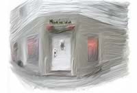
Submitter's comments: Here is a web site that you should take a look at for worst ever. This restaurant probably drives away business the site is so bad and the worst part is the menu pages. After a painfully long loading process, the animated pages of a menu automatically turn from appetizers through the entrees, but you have no control whatsoever if you want to stop on a page skip a page. Not to mention the lack of information, no prices, no phone number or address that I could find, and extremely abrasive fonts that make you squint to try to read it.
Vincent Flanders' comments: And we have a bit of Mystery Meat Navigation on the 490Kb Splash page. You have to click on the door handle to go inside (this is so incredibly stupid) where you are greeted with 63 images who take up roughly 1.4Mb of bandwidth.
The page that was submitted to me was the Menu Page. I'm not providing a link because it's an 8.3Mb animated GIF image and I don't want to eat up any more of their bandwidth than necessary. Recently, I had another site using the page curl technique which I haven't seen in years. I guess bad web design goes in cycles. I'd like to trade a bad web design cycle for a Harley.
25. Kentucky Center for Reproductive Medicine and IVF

Horribly bad. Java applet navigation and all.
When I saw the URL — kcrm-ivf.com — I thought the site was going to be a radio station. Obviously, nobody read Does Your Web Site Suck? Checklist 1 - Fatal Design Mistakes. I haven't seen beveled text in a long, long time.
24. Horserentals.com

Allow me to introduce you to horserentals.com. The main page itself isn't the absolute worst I've seen, but be sure to check out one of the state's pages.
I'm so proud of myself. When I saw the home page I said, "Gee, I've seen this before." It turns out I used this site as an example of bad web design back in October 2000. Guess what? It hasn't really changed. It still sucks.
In 2000, I used New Mexico as an example. It also looks about the same today.
23. NACO — global architecture

It's another damn architectural firm and it is pretty hopeless.
As one person commented, "The orange (on the splash page) hurts my eyes, the noise on the navigation page hurts my ears, and if you click on "interiors" it is spelled "interios" in the tag. Don't people have spell-checkers anymore?"
Submitter's comments: I read your site for ages and posted some comments but never suggested any site for your “horror gallery.” But the one I found today decided me to send you an email.
This is an industrial design agency web site and I think they wanted to make something “special” to illustrate their “creativity” skills. Click on any of the home page links: on each page of the site you have to ask yourself “what can I do,” “where can I click,” “Is this a link?” “What if I move the mouse over this?” I'm sure you will appreciate…
Excuse me for my poor English, this is not my natural language.
Vincent Flanders' comments: I left the submitter's comments pretty much as they were. It always amazes me when someone from another country apologizes for their “poor” English. I would be thrilled to be this “bad” in Spanish, German, French, or any other language. Heck, there are teachers here in America who would be thrilled if their students wrote like this.
Anyway, it's another damn architectural firm and it is pretty hopeless. Really fascinating Mystery Meat Navigation and, of course, you get the famous “Click to activate and use this control” or “Press SPACEBAR or ENTER to activate and use this control” message on every Flash page. C'mon FlashFolks.
22. DAAD
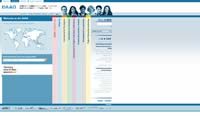
Sideways navigation is so easy on the neck.
Submitter's comments: I had to visit this site for my work.
Having to turn my head sideways to navigate made me think of your site and sure enough, this one's in the Tampax category.
Note from Vincent: Of course, they've fixed the site. Still, they can't hide from their past.
Vincent Flanders' comments: Ah, yes, Tampax. One of the worst non-Mystery Meat Navigation examples we have. Gee, you'd think people would notice this is bad. Unless I'm missing something, you have to go back to the home page to get to the navigation -- the sideways navigation. Priceless stupidity.
Other comments: Every web site that starts out with unorganized navigation links ends in catastrophe and this site is no exception. This is a good example of what happens when a sufficient number of page links are not provided when the first page of the site is constructed. Multiple styles and placement of navigation links have exacerbated the situation.
The English page has at least five sets of links, one set in German. The dialogue is sprinkled with 'more' links. The vertical links add a nice touch to the scramble. After that the site really falls apart. English must be chosen again on following pages but those pages also have some German dialogue and multiple sets of links.
Ok, I've looked at 5 pages and see no point in going deeper.
Here's a screen shot that is applicable to the discussion.
DAAD (The current, fixed site.)
21. Alser (UK) Ltd

I have been researching competitors' web sites today, as well as reading your excellent site to get tips for when we redesign our web site early next year, and I came across this site which seems to suck quite badly.
Thank God when our competitors screw up their web site
Submitter's comments: The home page isn't the worst I've seen, but click on the news, profile, history and products buttons - what genius thought up blue text over a predominantly blue image? Click on the contact button as well - have you ever seen such ridiculous, large, ugly buttons!! There is also a serious lack of useful information and I don't think it's been updated in a couple of years.
Wish all our competitors were so lax with their web design!!
Vincent Flanders' comments: It's a simple-looking site that's simply all wrong. My biggest web design complaint is the lack of contrast and we've got plenty of that mistake. Didn't anyone at the company look at the site and wonder why they couldn't read the navigational buttons? Maybe the English are some super race who aren't bothered by silly concepts like “contrast” and “readability.” Why did they use graphic buttons for navigation? Why is the TITLE tag — one of the most important tools used by search engines to index this site — called “home?”
I can't make heads or tails out of the source code, so I'm going to have to assume they're using Javascript to move the text. Sorry, TEXT DOESN'T MOVE except on movie credits.
Yes, we do wish all our competitors were this lax.


