The 20 Worst Non-Profit Websites of 2007: #20-11

If a commercial website sucks, it generally only affects the employees and stockholders of the company. Hopefully, they have the qualifications to go out and find another job if their company fails.
When a non-profit website sucks, the organization's clients get hurt — and they already are in a vulnerable state or they wouldn't be clients. There's more at stake with a non-profit website and there's more responsibility to "get it right."
Obviously, some clients of non-profit organizations, like universities, don't get hurt in the same way as a homeless shelter's clients would get hurt. Still, a poorly designed website tarnishes the luster of an organization.
Note: It's been eight years since this list was posted. Some / Many / Most / All of these websites have probably been fixed. If you find any, let me know which sites don't match up.
For examples of other non-profit and not-for-profit websites that suck, also read: The 20 Worst Non-Profit Websites of 2007 #10-1
20. Celibacy, Meditation, and Enlightenment

If you are going to have a site this controversial, at least employ decent web design.
I thought this was a Buddhist-based blasphemy, but it turns out the top section changes religions. I'm not sure how often, perhaps daily. Right now, it looks Christian.
Submitter's comments: I am using a monitor with a resolution of 1280x1024, and when I go to the site I am greeted with a "splash page" in the form of a poem that takes up the browser's entire viewport so that I have to scroll way down to get to the actual content. This "splash page" also includes a poor-quality audio file that has the site's owner speaking that begins playing as soon as the page is loaded.
Thankfully, an on/off button exists. The rest of the site is the usual too many fonts and colors, lack of organization, et cetera.
Vincent's comments: Yeah, it sucks, but for one of those "controversial" over-the-top websites it's pretty tame. What do I mean by "controversial?" Oh, some of the best sites would be:
- Accept Jesus, Forever Forgiven!
- Jesus Christ is the ONLY way to heaven!
- The Non-Moving Earth and Anti-Evolution Web Page
- The Earth is Not Moving
- Time Cube (now leads straight to ad for adult site)
- Space Ark
- Creation Museum, Taxidermy Hall of Fame of NC and Antique Tool Museum
19. Department of Spanish and Portuguese, UC Berkeley
I'll be surprised if this site hasn't been offered for your consideration previously! It is, as you will see, a miraculous collection of unreadable text, mysterious images, hidden navigation and questionable functionality; still worse, a large sum of money was paid to create this mess.
Although we can say that is passes cursory accessibility tests for the differently-abled. It may be the first website in history where blindness actually enhances the user experience.
Note: I know the site has changed. Unfortunately, I don't have a really good screen capture or video. I have a somewhat larger photo.
Vincent Flanders’ comments: When I first viewed the site in Internet Explorer, I assumed it was designed to work only in Firefox. Nope. It’s messed up in both browsers.
My pet peeve is lack of contrast between text and background so I ran the home page through AccessColor and found out “Both color difference and color brightness do not meet the recommended standard for 29.91% of the total text.”
This site is bad in ways I don’t think I’ve seen before — the strange use of type is especially puzzling. Very bizarre.
Actually, the most bizarre aspect of the home page is that it is “Valid XHTML 1.0 Strict!” Yes, we have proof that a page of valid code is still FUBAR.
Other comments #1: Too much "clever" typography that doesn't work.
It is never a good idea to have columns that don't fit single words. I get: "sea rch this website","cale ndar of events", "our libra ry on-line" and "subs cribe to the RSS feeds". My favorite though is "Reso urces where to find mo re information"
Also the leading is sucky, so that lines overlap — especially the "Faculty Web Logs"
This is in Opera on a PC.
Other comments #2: Well, when you look at it without reading the text, it looks like one of those early newspapers (only this time with colour).
What I really don\'t like is how text is large on the top and shrinks as you scroll down! The green text in the yellowish background is horrible!
18. Nanty Glo, Pennsylvania

Vincent, have I got a Daily Sucker for you! I just found a website whose background reminds me of Frankie Ford’s website, which was a Daily Sucker from sometime in the fall of 2006 — remember that one? Well, just one look at the city of Nanty Glo, PA’s website will make it feel like deja vu as far as backgrounds go, and that’s just the beginning of this site’s suckiness.
Submitter’s comments: Vincent, have I got a Daily Sucker for you! I just found a website whose background reminds me of Frankie Ford’s website, which was a Daily Sucker from sometime in the fall of 2006 — remember that one? Well, just one look at the city of Nanty Glo, PA’s website will make it feel like deja vu as far as backgrounds go, and that’s just the beginning of this site’s suckiness.
The menu at the left works just fine in Internet Explorer, but it’s a real pain to use in Firefox. Not to mention, the popup menus are just plain ugly, period. Also, most of the other pages on the site open in popup windows, and none of them that I looked at have any link back to the home page or anywhere else on the site.
If all that wasn’t bad enough, get a load of the area between the big constantly-changing photo and the quick jump site directory. You have to hover your mouse over that area just to see that there are links there, and they turn red when you do. Normally, they’re black – on a black background, no less! Therefore, you’ve got ZERO contrast and some of the worst mystery meat navigation I’ve ever seen all rolled into one.
Vincent Flanders’ comments: This site wastes an incredible amount of bandwidth. Their use of a 1Mb animated GIF makes Flash seem a rational solution. And what about the pictures they’re using in the animation? At least 3 of them are depressing. Is this the image they’re trying to give the outside world?
Speaking of animated GIFs, good buddy and co-author of Web Pages That Suck, Michael Willis, created a great animation and even better image of OJ Simpson. Not Suitable For Work and for those who think OJ didn’t kill anyone.
17. Brown University Research

Brown, Brown, Brown. Such a prestigious school; such sucky web design. The university has been featured a couple of times (back in 2005 and back in 2006) — not because I have a grudge against them (I don't) but because their designers keep coming up with really bad ideas and alumni keep sending them to me.
I like to think I'm a clever guy, but I can't come up with such a cleverly stupid idea for navigation as this page demonstrates. Seriously, I'm impressed.
16. Pinelands Regional School District

Make sure your sound is turned down.
Submitter's comments: hello i go to pinelands regional school district and ive always had problems finding things on there site and the site map is horrible lol guess google isnt getting my school indexed properly for a while
anyway here is my school's home page
the intro page is really funny too lol
Vincent Flanders' comments: Sigh. School websites are often poorly designed and you don't have to go too far to find a sucky example. You have to hate the unnecessary Splash page on this site.
Other comments #1: Vincent, I believe you about the "make sure your sound is turned down" statement. Right now, at the same time, I'm also listening to Sacred Music Preserved's net radio feed (www.sacred-music.org) and I could hear the roar over that, big-time!
15. Yakima County Clerk
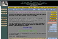
Dear Designers: You don't have to be afraid of using Contrast on your sites.
Submitter's comments: Too many buttons all over the place, multiple fonts and colors, color contrast issues in many places. Most of the links take you to PDFs.
There is no Contact Us link, which is a particular pet peeve of mine. I guess I shouldn't expect much more from a government website.
Vincent's comments: As was mentioned, this site has problems with contrast — the yellow (#ffcc00) text on the gray (#838383) background doesn't offer enough contrast to be easily read. An even worse example is the title "Yakima County Clerk." It's really hard to read and makes me believe that websites are being designed by birds — eagles to be exact. Their sharp eyesight is the only explanation.
You have to love the buttons on the right side. Looks like someone went to an online button maker and didn't specify the width.
Not marking PDFs (and other non-HTML documents) is one of my pet peeves, although Firefox has a great extension that warns you if you click on a link that will load a PDF. Speaking of Firefox extensions, here's a list of 200 Firefox extensions that save time and effort and answer the question, "I want a Firefox extension that will let me..." Oh. And the site also has "The Ultimate Web Developer List."
14. El Paso Water Utilities

This may be one of the most instructional reviews you'll read.
The comments were valid when they were written.
Submitter's comments: None. I somehow ran across this site.
Vincent Flanders' comments: There's a lot wrong with a site that, upon first glance, might not look like it qualifies for one of the worst sites of 2007.
- The logo is incredibly small.
- A lot of space is wasted at the top of the page. The "We support our troops" button isn't necessary. Of course, we support our troops. Duh.
- The top navigation is incredibly small, hard to read, and I suspect the contrast may not be sufficient. The good news is that, while the navigation uses Javascript, you can still click on the main link and it will take you to a page with the other links.
- I don't like the order of the navigational elements.The "Who We Are" link should not be first. People don't care who you are. They care about getting their problems solved.
- The "On-line Bill payment" graphic link is obscured by another graphic that's the same color.
- The worst mistake is there is no link/button to sign up for online payment.
- The second-worst mistake is they don't have a link to payment locations on the home page.
- The "Northeast Master Plan" graphic is an image map and it's difficult to read the "RFQ" button.This button loads a PDF and they get credit for mentioning this fact (and they mention the size of the PDF). Unfortunately, it's difficult to read. I clicked it without realizing it was a PDF.
- They lose points for not marking their PDFs on the Customer Service Page.
- They lose more points for needing specific fonts for their PDF. As Hillbilly Jim points out in the comments, "On the Customer Service page, when you click the Application for Industrial Wastewater Discharge Permit, a note came up on my machine saying they couldn't find a required font (WP-TypographicSymbols).
- The "Watering Schedule" graphic is an image map, which is also hard to read.
- There's no "Contact Us" link on the main navigation. Yes, there's one on the top-right navigation, but it's hard to see.
- Their choice of link color is poor -- not enough contrast (it's 2:80 when it should be at least 5:1).
- Several of their "Customer Service" links should really be on the home page -- especially "Start/Stop Service."
I think this list is a good start. I'm sure the comments will find lots of other errors.
Update: A reader brought up a very interesting point in an email:
Vincent, you missed the #1 problem.
El Paso is 76.62% Hispanic. Many residents of El Paso are recent immigrants. Many residents of El Paso are temporary residents on worker visas. Yet this site has not one button or link (that I could see) for translating the site into Spanish. I really hate to see the politics of English as an "official" language get in the way of customer service like this.
13. Covington Business Association
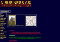
Submitter’s comments: This is the website for my home town of Covington, Indiana. It’s so bad that I'm going to make a donation to the town in support of a better website.
Vincent Flanders’ comments: Personally, I think you should give your money to some non-profit who can do some good. Doesn't anybody understand the concept of visual contrast? I ran the home page through AccessColor and received the following results:
Both color difference and color brightness do not meet the recommended standard for 15.22% of the total text.
Either color difference or color brightness does not meet the recommended standard for 18.84% of the total the text.
We also have multi-colored divider bars, centered and flush-left text, multi-colored text, and they've put the date the site was last edited (March 3, 2006). Oh, and the TITLE tag for the home page is “Home,” which doesn't help the search engines index the site.
Other comments: OK the marquees going in the opposite directions make my eyes cross. Somebody please tell them marquees are so Front Page 97. OOOPS! My bad. This sucker was made with Front Page 4.0. The map on the home page should be a clickable thumbnail; it's useless as it stands, at least at any resolution over 800x600. And what's with all the different colored text? Pick a color scheme and stick to it, already.
12. Town of Saugerties Police Dept.
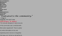
xmlns:o="urn:schemas-microsoft-com:office:office"
That pretty much says it all.... I could stop there but I found some other gems when viewed in IE.
- Most pages have a animated gif
- Click on "Crime tips" and your email client starts up with "Got Crime?" as the subject.
- The "Department News" thingie is simply strange.
- Right Click, "Function Disabled!"
- Charming use of color of course.
The site is now gone. Actually, the whole police department is gone. Here's a screenshot of part of the old homepage.
11. MIT Architecture
WTF is it with Architecture websites?
Submitter's comments: Pretty bad with the graphical links — some serious Mystery Meat Navigation combined with a load time for each graphic when you mouse over a link.
Vincent's comments: WTF is it with Architecture websites? I used to have a great deal of respect for the industry, but I think...I don't know what I think other than these people are one floor short of a complete building.
The sub-pages appear to be OK, except that the navigation fails the contrast test:
Foreground:#FFFFFF Background:#BABABA
Fail (The contrast ratio is: 1.91)
Text or diagrams and their background must have a luminosity contrast ratio of at least 5:1 for level 2 conformance to guideline 1.4, and text or diagrams and their background must have a luminosity contrast ratio of at least 10:1 for level 3 conformance to guideline 1.4.
Notice that they don't use MMN on the sub-pages. Hmm. This implies that either it's wrong to use MMN on the first page or their visitors are too stupid to have memorized the links on the front page to use them on the sub-pages.


