Worst Websites of 2009: Honorary Winners

Hundreds of web sites grace the pages of Web Pages That Suck during the year. Every three months I create a quarterly list of sites that I think will be candidates for the Worst Web Site of the Year. Amazingly, most of these candidate sites don't redesign their site and keep their "look."
Those are the sites that make my various "Worst of" lists. However, some sites learn from their shortcomings and "fix" their sites. Unfortunately, some of the ones that changed are really amazingly bad, which deprives me of bestowing them the honor they so richly deserve.
However, thanks to screen capture and video capture software, these sites can live on. Here are some sites that would have made this year's "Worst of" lists.
1. Jacksons of Piccadilly

Here's a video of the original site that shows why it qualified.
Submitter's comments about the original site: After trying to navigate this page, I've given up and decided to email you instead.
Not only do we have very pretty Mystery Meat Navigation, but my monitor is obviously too small because I can only access links that are in the middle third of the screen. I can't find a ‘non-flash' version (if one exists) because usually that's a link in the bottom right-hand corner that I can't see.
Vincent Flanders' comments about the original site: It's very beautiful MMN, but crap on a China plate is… still crap. I don't have any problems with the location of the navigation; I have problems with the Mystery Meat. My biggest problems with the site are the small text and the lack of contrast. Oh, if you go to a subpage, it isn't labeled. For example, I went to the Fine Art Competition page and tried to read it (dark gold text on a black background with a very small font isn't helpful). After I read some of the material, I forgot which page I was looking at. There is no marker explaining where you're located.
Pretty, but useless — bordering on pretty useless. With a flash of brilliance, they realized it sucked and they're fixing it.
Current site of Jacksons of Piccadilly that's being redesigned
2. Chrysler Aspen Hybrid

This is screenshot of the original site
Vincent Flanders' comments about the original site: This reminds me of that Microsoft Beta search engine Ms. Dewey (which no longer exists). Same concept except Microsoft used an African-American woman.
There are lots of valid uses for Flash on a car site — helping you build a car that you want to buy, looking at a car from different angles, etc.
Other comments #1 about the original site: She doesn't just insult you once, but so far three, no wait four - I'm waiting for five...oh yeah there it is. Wow - what is that?? New age customer service!!! They don't want us to look at the car too long? Oh now there is a sixth time. She is really looking peeved now! Then it goes to loop.... How original...
Other comments #2 about the original site: Maybe we should send them even more bailout money so they make an even crappier web site.
They fixed the site, but here's a larger screenshot.
Chrysler Aspen Hybrid — (This is the current site.)
3. MIAUK
WARNING: Could cause seizures!

Submitter's comments: Not sure if this is supposed to be ironic or what but it gave me a headache…
Vincent Flanders' comments: It gave me a headache when I first used it on July 9, 2007. Here's what I said then:
WARNING: Might cause seizures. The site is for a band/musician — not sure because I can't stand the flickering, which is why the site appears here (among a dozen other reasons)
As far as I can tell, MIAUK is still the same site as it was in 2007. How's that for progress? No steps forward and two steps back.
Note: The site has changed. I'll stick up a video soon. Fortunately, Archive.org has the home page in all its insanity.
If you don't want to risk a seizure, here's a screenshot.
Other comments: I can't even begin to describe the visceral horror and nausea I felt opening that beauty. Once I was able to successfully pick myself off the floor after the epileptic seizure I had suffered, I found much to my horror, that the rest of the world was still blinking and gyrating like that page was for almost a full minute before normality returned.
I think someone needs to contact their up-feed and close the site down before lawsuits ensue. Better still, maybe out of the goodness of my heart, I'll contact the American Epilepsy Society and get them on the case.
4. Dell Adamo Laptop

Of course, they fixed it. Here's a bigger screenshot of the original stupidity.
Submitter's comments about the original site: I get so lost trying to find the damn specs for the laptop they're selling.
Vincent Flanders' comments about the original site: I get so pissed looking at those snotty, bitchy models. The guy is the worst. It will be a very cold day before I buy another Dell laptop.
Other comments about the original site: Wow! That site is almost content free! The pictures were as annoying as listening to ads for a place while you are shopping at the place. If someone has gone to your site, they are already interested in your product; you don't have to sell them on it.
5. d/Lux/MediaArts
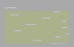
Click to see picture of old site.
Submitter's comments about the original site: The links move around onscreen. If you roll over a link, it blanks out all the other links. Quite unworkable.
Other comments about the original site: I am getting so very tired of these stupid Flash sites! Flash is a great tool; why do so many idiotic "designers" have to misuse it and give it a bad reputation? That low-contrast home page is visually UN-appealing; while the navigation (obviously "cute and imaginative" in someone's mind) is not well thought out. What are people who have impaired vision supposed to do?
d/Lux/MediaArts (This is the current site. It looks like a real website.)
6. Rocky Creek ATV Trail

Screenshot of original version of Rocky Creek ATV Trail
Submitter's comments about the original site: I saw this site and wanted to shout out "Sunday! Sunday! Sunday! Mud Boggin! Bring the kiddies!"
It has animated GIFs, rotating text, loud colors, jumbled blocks of text on the pages and a strange arrangement of menu items. Most sites put the link to the home page at the top of the menu!
Vincent Flanders' comments about the original site: You've got to be kidding me! There's a 90,672,768 byte media file that downloads when you visit the page. The video serves no purpose and should be removed. There's no reason this video should exist. This is just bad design. Speaking of bad design, the whole site is a classic example of Mistake #6 from Biggest Mistakes in Web Design 1995-2015 —"Have you ever seen another web site? Really? Doesn't look like it." I call this type of design the "I haven't taken my antipsychotics in a while school of web design."
Gee. I've never seen the word "Contactus" before. Is that some Roman god?
Rocky Creek ATV Trail (The current site)
7. MSY Technology

Submitter's comments about the original site: Vincent: Here's another site for you, if it hasn't been submitted before.
Here is a web page that will take you back to the dark ages of the Internet in the mid-90's, when changing font size and colour were considered the be-all and end-all of web design — at least by some developers' standards. This site, however, is maintained now and has no business trying to sell me anything! Have a look. Then go and clean your retinas with alcohol to take away the sting…
The most important thing that turns me away from even thinking about buying from these guys is that they deal in computers. My personal opinion is that any computer store web site should have a well thought out web page that is pleasing to look at — in the same way that I expect my mechanic to drive a car that runs smoothly and is not held together by rust. Anything less smacks of an unprofessional attitude toward me, the customer. I would not buy from this company purely based on this web site.
Vincent Flanders' comments about the original site: As the submitter notes, it's EXTREMELY important for your site to have a professional (or at least a semiprofessional) look. “If you don't look like a pro, the people will go” is a mantra for all web designers.
I suspect that, like many companies with sucky sites, they actually offer quality products. But who is going to take the time to find out once they see this site?
Other comments about the original site: Yep, their site sucks and their shops are scruffy warehouses in industrial estates (well, the Sydney one is anyway). So why are there always customers queuing out the door at their shops? Because, like their web site, they are brain-meltingly *cheap* and, to us, their bargain-hunting, geek customers, that's all that matters.
MSY Technology — the original site
MSY Technology (The current site)

8. Green Mountain Mall
Vincent Flanders' current comments: Green Mountain Mall has performed the ultimate in web redesign. They've killed the site.
Submitter's comments about the original site: Bright colors! Did they use a black and white monitor to create this site or was the person just color blind? And does anyone care where the gas meter room is located? (See "Lay out" button at top.)
The site has disappeared, but here's a screen shot of original site.
9. Horicon Public Library

Submitter's comments about the original site: I work for a nonprofit organization in the upper Midwest. I've been told to re-do our web site and, for some reason, my Director likes the look of the Horicon Public Library and is "strongly" suggesting I use this format. I'm a newbie and admit that I don't know a ton about web design, but I think I know sucky when I see it.
The tiny font for the address; the vertical text for navigation; and the not-so-intuitive navigation with all the assorted images. What was the designer thinking??? Tell me if I'm wrong, but I think this page sucks.
Vincent Flanders' comments about the original site: Of course, you're right. This site is awful. It's a library. A library is supposed to make it easy for you to find the information you're looking for. Sideways navigation? The Dewey Decimal System is not comprised of random numbers so why are they using Mystery Meat Navigation?
I think Seth Godin is a genius and one of his posts is basically a cleaned-up summation of Web Pages That Suck:
"Do you want the people visiting this site to notice it?"
It's a subtle but essential question.
For artists, musicians and web 2.0 companies, the answer is probably yes. Yes we want people to see the interface or remark on our skills or cleverness.
For everyone else, it's no. The purpose of the site is to tell a story or to generate some sort of action. And if the user notices the site, not the story, you've lost.
Amazingly, this means that not only can't the site be too cutting edge, clever or slick, it also can't be too horrible, garish or amateurish. It's sort of like the clothes you want the person giving a eulogy to wear. No Armani, no cutoff jeans.
Most people want their dentist to look like a dentist and not someone going to the opera. People of Horicon: Look like a library web site and not a photography web site.
Here's a screen shot showing the original site.
Horicon Public Library (Current site)