The 10 Worst Websites of 2007

Web design is an art. Great web design occurs when design and content are seamless and you don't notice its greatness.
Unfortunately, 2007 was among the worst ever for great web design, but it was wonderful for bad design. Most of the sites look like the designer never read (or ignored) my article Does Your Web Site Suck? Checklist #1 — 155 Mortal Sins That Will Send Your Site to Web Design Hell.
Most of the sites featured on Web Pages That Suck also committed one or more of the Biggest Mistakes in Web Design 1995-2015 including the following:
- We've designed our site to meet our organization's needs (more sales/ contributions) rather than meeting the needs of our visitors.
- It takes longer than four seconds for the man from Mars to understand what our site is about.
- Our site looks like we've never seen another web site.
- We use design elements that get in the way of our visitors.
- Our site doesn't make us look like credible professionals.
10. moiré

They fixed the site, but that doesn't mean they can hide. Thank goodness for Archive.org — there are times when they actually capture a site. This site's "navigation" is unique, which is why I'm sending you to a cached copy.
Submitter's comments: I've never seen anything like it before, and can't conceive of any reasonable explanation for this utterly gratuitous use of Javascript. Using Javascript to alter the background color isn't new, clever, original, or remarkable — except in this case, where the results are remarkably hard on the eyes. Yes, I know there's a dispensation of sorts for graphics design sites, but in this case, if I were looking for a graphic design studio to work for me, I'd run the other way as fast as possible.
I also notice that one of the examples that pops up when you click the last link, "Two Steps Back, a book for 55 Diesel, Milan" has an image with severe glare from the lighting, plus a large empty area on the left. What is the point of that?
Be sure you have web page-specified colors enabled, ditto Javascript...
Vincent Flanders' comments: Someone once said, "Empathy is an effort to understand someone's experience as she experiences it and to convey that understanding." I tried my very best to understand what would cause someone to use this design technique. I looked deep within my soul for an explanation.
I will try to convey my understanding of the experience of this site. The only explanation I can come up with is this web site has a subdural hematoma. Wait a minute, that's what sent me to the hospital four years ago.
One of the best examples of a "Subdural Hematoma Web Site" (S.H.W.S.) is Accept Jesus, Forever Forgiven! After looking at the site you will feel nauseous, disoriented, numb, weak, dizzy, and have a headache. If you stay too long on the site, you'll slur your speech, your breathing pattern will change, and you'll start to lose consciousness. Only the thought of death will keep you alive. That, and the thought that maybe you'll become an amnesiac and forget you ever visited the site.
This site isn't as bad as the "Accept J" site, but it's training to be such a site. That would make it a "Subdural Hematoma In Training" site — or "S.H.I.T."
Other comments #1: This web site scared me. I came to the web page expecting a rainbow of colors. All that greeted me was an innocuous white background and black text. Nothing that great, but not at all the cornucopia of color I was expecting.
Then I rolled over the links.
It was a horrible experience that didn't end with clicking the link. Since a different page was active, I thought it would hold the background color to just one color, but no, as I moved my mouse over the new page, the old page kept right on changing color. I exited before losing consciousness, thankfully.
Other comments #2: W3C.org validator says 376 errors. This site was not looked at by any validator, obviously. The errors found by W3C were not the "missing alt tag" kind of things, either.
Other comments #3: Do these presumably Conservative Christians realize that their web page looks like a gay pride parade on crack?
moiré (at Archive.org)
9. KC The Catalog

Submitter’s comments: This site blows.
Well, they "fixed" it, but here's a video showing you why it made the list.
Other comments #1: This is some of the worst navigation I've ever seen. THE WEB IS NOT A BOOK!!! If you want to flip pages, get the g**d**n catalog!
Other comments #2: This is not much better than just scanning and posting the catalog as a PDF. When will these companies learn (bicycle parts companies I'm talking to you) that people want to search and buy stuff online, not just look at a page load heavy catalog. My husband spends thousands on bicycle parts, and maybe luckily for me he spends less than he would, due to frustrations with online shopping.

Vincent Flanders’ comments: I like a person who cuts to the chase. There’s no waffling or hint of ambiguity in his/her opinion.
(All comments are about the original version.)
I don’t have the slightest idea what this Flash-based monstrosity is about. Initially, I didn’t notice the zoom icon so I wondered how in the heck I was going to read the tiny text. Even after I click the zoom icon, I still have to stick my face in front on the monitor and squint my eyes to try to read the text.
Just remember that no matter how stupid this site is to normal folks like you and me, somebody or a group of people had to look at the site and say, “Damn, this is hot, hot, hot.”
Well, they "fixed" it, but here's a video showing you why it made the list.
KC The Catalog (the "fixed" version)
8. Tally-Ho Uniforms & Accessories

Why this site is included is obvious to everyone but the site owners. But it's always that way.
Submitter's comments: Pretty bad site. Trailing cursor, distracting background, animated GIFs, and ugly color: What more can you say?
Vincent Flanders' comments: They've been "Serving Airlines Throughout the World Since 1948" -- which is when their web site was created. OK, Al Gore hadn't invented the Internet in 1948 (actually, he was born in 1948) but this site has that old, old, sucky look that people don't believe still exists.
Uh...Their logo has "Accessories" spelled "Accesories" and I don't think that's the British spelling. I also love how they mix and match centered and left-justified text.
Other comments #1: I don't always agree with your "suckers" because some of them (though your points about navigation are certainly well taken) are quite artistic - and clear took a lot of effort.
That said - this one absolutely deserves the "honor" you have bestowed upon it. A pet peeve of mine is if you have the time to indicate an item is discontinued, you probably have time to delete it from your page. Half the crap on this site is no longer available.
Other comments #2: A good example of all the doodads available to a webmaster skilled in animation but short on common sense. After a few web sites loaded with animation hung up my processor I decided animation was not a skill I needed to learn. Properly constructed and located navigation page links can salvage just about any crappy web site. But this site needs a complete re-construction, preferably by an adult this time. Don't you just love to scroll pages?
7. Fred Frap and His Imaginary Friends
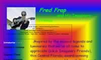
"Colorful" is the first word that comes to mind. Doesn't seem to work in Firefox, Opera, or anything that isn't Internet Explorer.
Submitter's comments: BTW, I think it only works on IE 6, I think the author created it in Word.
Vincent Flanders' comments: My eyes! Of course they've revised the site.
Here's a screen capture of the original worthless splash page.
Here's a screen capture of the original home page.
Here's a screen capture of the original Sightings and Listenings page. Scrolling sucks.
Fred Frap and His Imaginary Friends (the current, "fixed" web site)
6. BVS Performance Center for Banks

God, how I hate these skeuomorphic navigation schemes.
Other comments #1: I just looked at their "real" site and the guy won't talk to me because I don't have Windows media player Version 9 installed and I can't click on the building to enter because it says I need IE 5.5 or higher. I'm using Safari 2.0.1 on the Mac At least the navigation worked for me on this site.
Other comments #2: This site has earned the N.K. Tearful 'Why?' award. I never found the 'real' site because there isn't one. This site has all my favorites: MMN, I-Frames, PDF files, scrolling, wordiness, etc., etc. The banner wasted enough space for 56 to 84 page links. The site uses MMN and requires scrolling. The site utilizes about one sixth of the screen to advantage, and half of that is wasted with navigation instructions, superlatives, and adverbs. A web site that needs navigation instructions is a failure. I saw a site just like this once before, it is a children's site called Eric the Croc. Remember your first English composition class when your teacher required you to write a small piece that was one page long? Most children stretched the longhand script to fill the lines as quickly as possible with very few words. The person who wrote this site commands a large vocabulary but hasn't learned to write with brevity. A web site shouldn't read like Jane Eyre or a novel by Dickens. I just love it when they have to explain acronyms. The example below could be shortened to: "We will teach you how to cater to your customer's banking needs."
Example: Hello. Welcome to the Sales, Incentive and Information Management System, otherwise known as SIIMS. This is the CRM system that helps bankers generate revenue, build value for shareholders and provide superior service to customers.
The heart of SIIMS — the TotalView Relationship Management Program — is designed specifically to help you get a complete picture of your customers and their needs. It's the key to establishing more relationships that work, for your bank and your customers.
If you're already registered to use the TotalView Program, click the Sign In button below.
If you want to see "The TotalView CRM Story" video presentation or visit the Performance Center, click the appropriate button.
Ok, I finally found the all important PDF and figured out what they are selling.
BVS Performance Center for Banks (this is the current, "fixed" site)
Their goofy metaphor navigation scheme (the old, "unfixed" site)
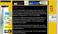
5. OPEN BEXI
Vincent Flanders’ comments: (loud sobbing sounds)
Other comments: Horrible UI. I'd cry if someone made me use it.
Submitter’s comments: Yikes! This site is even worse for the fact that it intends to spread horrible design through its new HTML builder tool.

Other comments #1: I'm blissfully ignorant about code writing and forty years past Latin, Italian and Spanish, but I think if one is going to publish in a foreign language, it's probably a good idea to find a foreigner to write the script. I'm sure it took them only seconds to build their page if appearance is any clue. I've noticed that the 35+ pages web site I'm working on now can take weeks for gathering information, fitting it, and then tweaking it for usability by the visitor. Color cueing and capitalization for usability requires a great deal of discipline. Pages that are the easiest to comprehend take considerable effort to build. I really don't care how a page works technically, just so it works every time.
Other comments #2: That 'created with' logo in the corner? 1024 pixels wide. It's squished so small you can't read it.
Note: They fixed the site, but here's a screenshot of how the site originally looked.
Here's a screenshot of how the site originally looked.
www.openbexi.com (this is the current site and it still sucks a lot)
4. Usability Net
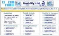
There's a phrase called "unclear on the concept" that applies to this site. Flash navigation has usability issues and you would think a web site about the topic of usability would understand this fact.
Vincent Flanders' comments: There are some things you just don't do if you want to be politically correct, but I've always been a rebel without a clue. You just don't critique usability experts if you're involved in the same field AND your web site sucks.
One of my favorite singer/songwriters is Chris Knight. He has a song called "It Ain't Easy Being Me" and these four lines explain why I chose this site:
There ought to a bridge somewhere they could dedicate to me
I'd probably come to the ceremony with a can of gasoline
Walk on over to the other side where I'd light a match
Sit and stare through the smoke and flames and wonder how I'm gonna get back
Let's make UsabilityNet, which bills itself as "A European Union project that provides usability and user centred design resources to practitioners, managers and EU projects," one of the worst sites of 2007. Gee. Where's the match? It's time to blow up the bridge.
I chose them because I simply cannot believe they use Flash navigation. When I visited the site I I was using Firefox with the Flash Block plugin and basically got a blank screen.
I realize UsabilityNet discusses their reasons for using Flash, and they claim they're working on an HTML version, but it looks like they've been working on it since 2003. I can't think of a reason they would use Flash. Can you? I think it sucks like a bilge pump. Maybe it sucks like a black hole. Hmm. It sucks like a lousy hair band from the 80's playing at an Indian casino.
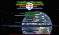
3. Creation Museum, Taxidermy Hall of Fame of NC and Antique Tool Museum
Submitter's comments: It's not just that I think their ideas suck. The web site really sucks. Try finding their phone number. Try finding the hours of the museum. They must not care if people make it there.
Vincent Flanders' comments: Unfortunately, in the battle between appearance and reality, appearance wins on the web. If your site looks like it was designed by a psychotic, people aren't going to trust the content.
In my speeches I use an example of a business site I call "The Vincent Flanders School of Dentistry and Auto Body Repair." The name of the school always gets a laugh because...well, it's "out there." The #3 Worst Site knocked down, ran over and trampled the name of my school — "Creation Museum, Taxidermy Hall of Fame of NC and Antique Tool Museum."
This site is a classic example of Mistake #6 from The Biggest Mistakes in Web Design 1995-2015 — "Have you ever seen another web site? Really? Doesn't look like it." I call this type of design the "I haven't taken my antipsychotics in a while school of web design."
Creation Museum, Taxidermy Hall of Fame of NC and Antique Tool Museum
2. Microsoft

Quite frankly, a company worth billions of dollars can spend a few bucks and make sure there's sufficient contrast between the text and the background. It's not just about web standards; it's about making your site easier to read. The lack of contrast is either arrogance or stupidity.
Vincent Flanders’ comments: NOTE: Microsoft makes #2 because there is no reason for this type of amateur mistake coming out of corporation like Microsoft.
I was reading a post on a Microsoft blog about how the yet-unreleased Internet Explorer 8 passed the Web Standards Project's Acid2 test. Hmm…Microsoft and web standards in the same sentence?
One of the ADD thoughts that ran through my brain was, “Hey, go run Microsoft’s home page through AccessColor’s color contrast and brightness test.” The results will have nothing to do with web standards, just the ability to code a page in such a way that the text is readable against the background. It’s all about visual contrast and it's important to be able to read the page.
This is the specific Microsoft home page I ran through the analyzer and here are the results I received:
Click on the picture to see the complete results (382 Kb)
- Both color difference and color brightness do not meet the recommended standard for 62.13% of the total text.
A Fail message is displayed next to the HTML source line. - Either color difference or color brightness does not meet the recommended standard for 0.53% of the total the text.
A Warning message is displayed next to the HTML source line.
Now, I’ve never met a stupid person who worked for Microsoft (some have been a little too Lifespring-ish or est-ian for my taste), so I have to ask myself, “Don’t they understand it doesn’t cost millions of dollars to make your page readable?” OK, they’re stupid.
Microsoft home page — screenshot showing contrast problems
Microsoft’s Home Page (may or may not resemble the page I captured).
1. Ace of Cakes
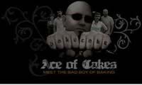
Yes, I know this site should really be included in the Worst Web Sites to Navigate of 2007 because of its use of Mystery Meat Navigation. Unfortunately or fortunately, that group of sites is so horrible and there were so many entries that I moved Ace of Cakes to this page.
Submitter's comments: I just visited aceofcakestv.com, Duff’s web site from the TV show "Ace Of Cakes" on the Food Network. WOW, what at great example of Mystery Meat Navigation — and abuse of Flash.
Vincent Flanders' comments:
My wife is hooked on all these cooking shows, especially the competition ones like "Top Chef." Since we're opposites, I don't like them and that's funny because I...uh...really like to eat.
Of all the cooking/food shows on, the absolute worst one is Ace of Cakes (with the ranting and raving of "Iron Chef" a close second) and so it's only logical that their site would suck. As far as Mystery Meat Mystery Cake Navigation goes, this site has one of the worst examples around. When you get to the last frame, you can still click on "Next," but it's dead.
Like many Flash sites, there isn't anything here that wouldn't work better in HTML. Here's what Flash is good for (and this occurred at Seattle's Woodland Park Zoo!
Other comments #1: If you have to provide a link for help on how to use a site, you've done a very poor job. Navigation should be intuitive.
Other comments #2: I got a new program yesterday called 'Flashmute' that keeps Flash programs quiet. Worked great on Ace of Cakes site!
Other comments #3: If I could only say one thing, it would be that this site is a very disturbing misuse of Flash. The sounds are annoying enough, the mystery meat navigation is bad and the random broken links and the like are truly stupid.
However... I do sometimes think that this site could have broken the guideline types... or the stuff in the book for this site. Because in essence, it's a site for a TV show and it could be argued that they are like movie sites and shouldn't be judged as harshly and blah blah blah.
Note: The Ace of Cakes site discussed is no longer in existence. It's now a domain for sale. The Food Network moved the site to its domain.


