Videos About Web Design

Over the years, I've made a number of videos discussing web design. A few are simply excerpts from my speeches. Most of the rest were created quickly—many in only one take—because we're talking about bad web design and bad web design should be obvious.
Big Picture Issues

Self-explanatory.
Doesn't Look Like A Professional
If you don't look like a professional, people won't do business with you.
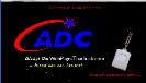
ADC — WPTS.TV version.
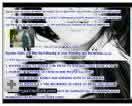
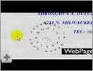
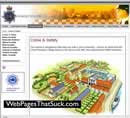
Where's the Focus?
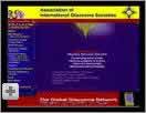
As the person who submitted the site said, "Between the operatic 'Glaucoma Hymn' that downloads and plays as soon as you come to the main page (with no 'Stop Playing!' button), the bobbing heads of (what I presume are) the AIGS Board in the upper-left hand corner, there's no clear explanation of what this organization DOES on the main page."
The International Association of Glaucoma Associations — YouTube version (0:47)
The International Association of Glaucoma Associations — WPTS.TV version.
Back-End Coding Errors
If your site breaks because of coding errors, people won't feel comfortable buying from your site.
Gandolfo's — WPTS.TV version. Higher quality
Flash- / Ad-Blocking Software
I use software to block ads, popups, popup ads, and Flash. Lots of folks use these products and it can cost your site money. It can also mess up your design or, in the case of NASCAR, it may improve the look.
NASCAR — YouTube version (2:20)
They Didn't Identify PDF Files With An Icon

If a link is a PDF file or non-HTML file, it must be identified as such.
Bath Junkie — WPTS.TV version.
Separated At Birth (1996)

There are times when two sites look amazingly (suspiciously?) alike.
Separated at Birth — YouTube version (1:51)
Requirements to View Your Web Site

Forcing people to have Flash, Javascript, cookies, or whatever is not a good idea. If you make it difficult to use your site, people won't use it.
Frontier Airlines WPTS.TV version.
Where's the Focus?
Of course, it's been fixed. Still, you need to see it, understand why everything is wrong and then not make the same mistakes.
Hayden Video Wedding — YouTube version (1:23)
Text Issues

There are many different ways you can mess up the text on your site. Here are videos showing a few of the techniques.
Multiple Text Sizes and Colors
Don't mix and match multiple colors and text sizes on the same page.
Multiple text sizes and colors — YouTube version (1:04)
Multiple Text Sizes and Colors — WPTS.TV version.
Lack of Contrast
If there isn't enough contrast between the text and the background, people won't be able to read your content.
Unisys — YouTube version (1:25)
 Very Bad Contrast
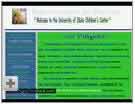
The University of Idaho fixed it, but I have a copy from the old days.
University of Idaho — YouTube version (0:21)
Trailing Text Cursor
Using a trailing cursor on your web site brands you an amateur.
Dermatology SC — YouTube version (0:27)
Text Doesn't Match Graphics
You can look pretty stupid when the graphics don't match the surrounding text.
Text Doesn't Match Graphics — YouTube version (1:11)
Graphics Issues

There are lots of ways to screw up your graphics. Here are some good examples of bad graphic design that negatively affect your web pages.
Inappropriate Use of Graphics

Racial stereotypes at Amazon.com.
Amazon.com — YouTube version (0:43)
Amazon.com —
WPTS.TV version
Shadows on Graphics

It's not a good idea to use shadows on graphics. This video will show you why.
Shadows on Graphics — YouTube version (1:13)
 Graphics Are Too White
Sometime, graphics can be too white.
Graphics Are Too White — YouTube version (0:39)
3-D Graphics
Just don't do this.
3-D Graphics — YouTube version (0:09)
Excessive Graphics
These graphics detract from the page.
Mary Kay dealers — WPTS.TV version
Most Horrible Banner Ad Ever Created

Yes it's real. There are bad ads, really bad ads and then there is this ad. It's jaw-dropping bad.
Most Horrible Banner Ad Ever Created — YouTube version (1:37)
Navigation Issues

Good navigation is essential to a web site's success. These folks missed the lecture.
Bad Navigation Metaphor

A navigation system built on the concept of a virtual reality room isn't a good idea. Just as you shouldn't play with your food, you shouldn't play around with navigation.
Bad Navigation Metaphor — YouTube version (1:22)
Sideways Navigation

People don't like to turn their head sideways to read navigation — especially when the contrast is poor. Even their target audience will find this scheme annoying.
Tampax — YouTube version (0:41)
Symbolic Navigation
When you use pictures of buildings for your navigational metaphor, you're in trouble.
Dorsett Police — WPTS.TV version (0.55).
Mystery Meat Navigation

Unfortunately, many sites use Mystery Meat Navigation (MMN). A now-defunct article had a great definition of MMN:
Mystery meat navigation (also abbreviated MMN) is a term coined and popularized by author, web designer, and usability analyst Vincent Flanders to describe user interfaces (especially in web sites) in which it is inordinately difficult for users to discern the destinations of navigational hyperlinks—or, in severe cases, even to determine where the hyperlinks are. The typical form of MMN is represented by menus composed of unrevealing icons that are replaced with explicative text only when the mouse cursor hovers over them.
Flanders adopted the epithet mystery meat because, like the unidentifiable processed meat products historically served in many American public school cafeterias, MMN is unfathomable to the casual observer. Before conceiving the term mystery meat navigation, Flanders temporarily described the phenomenon as Saturnic navigation, a phrase named for the Saturn Corporation, whose web site formerly served as a high-profile example of this web usability problem.
Toto

Using human butts as navigation brings new meaning to Mystery Meat Navigation <grin>.
 Toto (2:05)
OXO
An early example of Mystery Meat Navigation from late 1999 or early 2000.
OXO (2:02)
Mathew Mahon
Stupid Mystery Meat Navigation. Oops. "Stupid" is an unnecessary modifier.
Mathew Mahon — YouTube Version (1:18)
Crumpler Bags
The #2 worst Mystery Meat Navigation site for 2006.
Crumpler Bags — YouTube Version (1:15)
Crumpler Bags — WPTS.TV version.
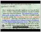
Diners Club

The 10th worst web site of 2006,
Diners Club — YouTube version (0:42)
University of Calgary

They fixed the site. This is what it used to look like.
University of Calgary — YouTube version (0:45)
Optimal World

It's amazingly bad. Also won Worst Navigational Web Site of 2006.
Optimal World — YouTube version (1:21)
Optimal World — WPTS.TV version. (1:22)
SEO Issues

Search Engine Optimization is a key element in web design.
Search Engine Optimization Secrets
Vincent Flanders tells you all you need to know.
SEO Secrets — YouTube version (2:24)
Miscellaneous Issues
Just what it says - a catch-all category.
Not Testing Your Registration Links
Jakob Nielsen didn't want you to register for his seminar.
Not Testing Your Registration Links — YouTube version (1:15)
Not Testing Your Registration Links — WPTS.TV version.