10 Worst Website Uses of Navigation for 2007

I love great web design. The designers who create great web sites know that you have to combine content and design in such a way that a web site flows seamlessly from page to page. The visitor never has to ask, "What do I do now?"
Unfortunately, 2007 was a banner year for bad web design and for bad web navigation. The worst type of site navigation is Mystery Meat Navigation (MMN) and 2007 was a banner year for this crappy design technique.
I love irony and I find a great deal of irony in the fact that Sites #5 through #1 on this list are actually worse than anything on the Worst Websites of 2007 list.
As I mentioned, 2007 was a banner year for MMN. For those of you who aren't familiar with the term, a little backstory is in order.
What is Mystery Meat Navigation?
A now-defunct article had a great definition of MMN:
Mystery Meat Navigation (also abbreviated MMN) is a term coined and popularized by author, web designer, and usability analyst Vincent Flanders to describe user interfaces (especially in web sites) in which it is inordinately difficult for users to discern the destinations of navigational hyperlinks — or, in severe cases, even to determine where the hyperlinks are. The typical form of MMN is represented by menus composed of unrevealing icons that are replaced with explicative text only when the mouse cursor hovers over them.
Flanders adopted the epithet mystery meat because, like the unidentifiable processed meat products historically served in many American public school cafeterias, MMN is unfathomable to the casual observer.
The following sites are the worst of the worst web site navigation that appeared on Web Pages That Suck during 2007.
#10 Dept. of Energy

It has a great URL, but I don't have the slightest idea of what it is or what it does. I'm assuming it's a trendy clothing store or some other kind of trendy business that doesn't care about solving their visitors' problems. When you try to visit the site now, you get a "Forbidden" message. Thank goodness for Archive.org.
Submitter's comments: I don't know it you have seen this site before, but it resizes your browsers, flashes enough to give you a seizure, and last but not least it a prime example of mystery meat navigation.
Other comments #1: Wow. Video game producers, movie theaters, and haunted houses all have warnings about the content having the possibility of causing seizures, all at an attempt to avoid or at least minimize liability. Having a domain like such as “deptofenergy.com,” one, which is likely to be viewed by someone other than their target audience, loading a home page with such large flashing content is not only a ridicules concept in itself, but an invitation for a lawsuit.
Other comments #2: N o t e t o w e b m a s t e r: B r e a t h e i n, b r e a t h e o u t. R e p e a t a s n e c e s s a r y.
When you click on the link, you get a 403 - Forbidden page. There's a way to bypass it, however.
Dept. of Energy -- from Archive.org (here are a bunch of other versions) The Dept. of Energy -- current site is now a "Forbidden page"
#9 Microsoft Visual Studio 400 Differences

After visiting this site, someone wisely stated, "This is what happens when a marketing department is allowed complete control over a web page. All flash, literally in this case, and no substance. I work in a marketing department and all of our web sites would look like this if our design/development team didn't rein them in."
They've fixed it. I'm making a video.
Submitter's comments: I was doing research on upgrading projects from Visual Studio 2003 to 2005, and I came across this monstrosity. This is easily the biggest botch of an attempt to convey information I have seen in a site. Things to note:
- Annoyingly long and worthless Flash intro.
- The actual content takes up only about 2% of the screen; not even the top-left 2%, mind you, but down near, but not at, the bottom-right corner. (I guess if you find it, you get some sense of accomplishment). About 5% of the screen is dedicated to an awful navigation bar, leaving 93% for -- not much of anything, to be honest.
- Navigation which is (a) side-scrolling, (b) runs away from the cursor, and (c) is just a list of numbers instead of something useful.
- No organization of the information at all. 400 features to look through, good luck finding what you want.
- The page is in English, despite the 'germany' subdomain. (Not that it would be useful in any language).
Vincent Flanders' comments: Life would be so much simpler if the information was provided in a form we could understand.
#8 Bow-Wow Books

This is just terrible. There is cute and then there is "too cute for your own good." The version for children is beyond terrible because nothing is there. With the adult section, which you can't really identify as such, there's at least a couple of pages of explanatory text.
The most important page is the one I clicked last. Their dog should bite them on the ankle.
Submitter's comments: I'm not sure if you've already featured this site as a Daily Sucker, but I was just flabbergasted when I came across it today: Bow-WowBooks.
First, a splash page, which I know you hate. Then, you enter a series of web pages that have no words on them at all — just boxes with cartoons that you're supposed to click on to progress to the relevant section. The problem is, the only way I can see to tell which box takes you to what type of content is either to just click and see where you end up (which is often just another page with more confusing, unlabeled boxes), or to hover your mouse over the image and check the browser's status bar to see what the page is named (for example, after you go through the splash page, if you hover over the two boxes and look down, you'll see the left is for "kids" and the right for "adults").
The comics themselves aren't even obviously giving you clues as to the pages they'll take you to — for example, if you click on the "adults" box on the second page, you'll see three new comic boxes: the left has a dog with books in its mouth, which I can see is for a page about "books," the right has a dog using a cash register, so "Store" — okay, maybe I can give them those.
But the middle features a dog looking angrily at a. . . telephone pole? Or. . . ? And that's what you are supposed to click on for "info" (which, incidentally, just takes me to three more comic boxes that are completely meaningless except in retrospect — once I KNOW the dog howling at the moon is for "contacts," I can sort of see it, but why not just write CONTACTS on it?)?
I'm just astonished at the bad navigational design of this site!
Wow. Not bow-wow, just. . . WOW.
#7 jones, partners: architecture
As I've often said, "If architects built buildings the way they build their web sites, then the first woodpecker to come along would destroy civilization." I've got a whole article on architectural web sites.
To say the jones, partners web site is a piece of crap is an insult to crap and, dammit, capitalize your name. Only e.e. cummings gets to use lowercase.
Submitter's comments: A front page that requires you to take a quiz before you can enter the site, distracting Flash animation, hidden navigation tools and pretentious text. This site has it all.
Vincent Flanders' comments: Many/Most/All architecture firms' web sites truly exist on the lower levels of web design hell. Maybe architects spend so much time in tall buildings their brains become oxygen deprived. While architects understand that buildings must work or fall down, they don't understand that web sites are the same way.
I'm not sure about the quiz. I didn't see one in IE, Firefox, or Opera.
What is it with architectural firms like M E D I U M, ushida findlay, Illinois Institute of Technology College of Architecture, Torchia, and a bazillion other firms?
Other comments #1: What was going through their mind? This certainly isn't corporate. I feel sorry for frequent visitors having to wait a few minutes before they can get to the site. Oy! Hidden links, Mystery Meat Navigation, ridiculous music, ostentatious text ... looks like a French Art film.
Other comments #2: It at least makes me feel better about my own poorly designed web site.
Other comments #3: Regardless of who the audience is, this site is simply terrible! I mean truly, truly awful. It hijacks the browser window and won't let me resize it making all the text absolutely huge so even if I wanted to read all that utter crap it'd be a painful experience. Then there's the *INVISIBLE* MMN! To continue the building/web site analogy, I guess in their buildings you have to push all the walls until you stumble into the room you were looking for.
#6 Leo Burnett Canada
Here's a site that made the Daily Sucker back on September 23, 2005, but somehow didn't end up on Worst Web Design Techniques Featured on Web Pages That Suck in 2005. I made it a Daily Sucker in 2007 (yes, it's that bad) so the site gets its proper credit.
Submitter's comments from September 23, 2005: What kind of "Mystery Meat Navigation" is this?
Vincent Flanders' comments on September 23, 2005: Yes, I know that this type of company (advertising) must use this Mystery Meat Navigation (MMN) because they're in the business of looking cool. They realize they need to present an art-fart image to their audience but this technique gets seen by those web designers who design for auto parts stores and doctors. Next thing you know, MMN starts showing up on "normal" commercial sites.
Of course, there's no HTML version of the today's site using cascading stylesheets and Javascript. There's no reason for this design because it's meant to impress the uninformed, but this isn't some third-tier firm — they're important and if you don't know who they are, why are you even visiting the site?
Other comments from 2005: You know, I'm not one who automatically judges a site to be bad just because it's done in Flash. But then I don't automatically assume that HTML sites are crappy, so maybe I'm biased.
Another point about Flash and JavaScript: there is a very important sector that doesn't have Flash and JavaScript enabled, and that's the search engines. Make your site inaccessible to text-only browsers and screen readers, and you make it inaccessible to Google.
Perhaps with this site it doesn't matter quite so much; maybe the intended audience already knows about the company's existence. Undoubtedly the intended audience expects something out-of-the-ordinary, and for some out-of-the-ordinary things, Flash is the most efficient way of doing it. Granted. But will the intended audience be able or willing to navigate the site? We're talking busy executives who probably have as much patience and computer know-how as Dilbert's Pointy-Haired Boss. If the PHB can't work out this site (and the PHB famously can't tell the difference between a laptop and an Etch-a-Sketch — and my experience tells me that's frighteningly close to the truth), it will fail.
Other comments from 2007 #1: This is HORRIFYING. Still, at least it's fun to jazz it up by writing "wankers" across the screen with the pencil.
Other comments from 2007 #1: These guys are so old and so prestigious and so respected that they don't need Google or Yahoo. They don't need PHBs. It doesn't matter to them what we think.
They're doing advertising campaigns for Fortune 500 companies. They have contracts with governments across the country from small towns to the House of Parliament. They don't even need a web site. They are *that* big.
I don't even know why they bother.
#5 Zaha-Hadid Architects

Zaha Hadid won the "Nobel Prize" of architecture so I went to her web site. If her architecture is as bad as her web site, you'll never be able to get into — or out of — her buildings. It's nice to see that a female architect is just as stupid and dense about her web site as her male counterparts..
I thought the MOMA site (Video) was bad. This one is dark, forbidding, impossible to read (the text is too small), absolutely can't be navigated— you have to chase around with the mouse and hope that maybe you'll run over something that might tell you where to go... but then whatever you might have caused to appear on the screen disappears again! I sought out the beloved "skip intro" link only to watch it fade away before my very eyes.
The website has been changed. Unfortunately, it's a different kind of crazy.
Another wise person stated, "Do you think the architects are having a contest to see how many of them can make Web Pages That Suck? Maybe we should see if we can find an architectural firm who doesn't have a sucky web page.
Zaha-Hadid Architecture (video of the original site).
Zaha-Hadid Architects (Current site — still sucks)
#4 Adobe Creative Mind
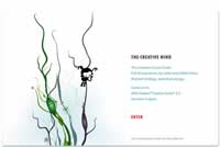
Just because you're the People's Voice Winner in the category of BEST USE OF ANIMATION OR MOTION GRAPHICS at the 2007 Webbys doesn't mean you aren't the leading contender for Worst Web Site of 2007 at Web Pages That Suck.
This site was the leading contender for the worst navigation site for the longest time. But one of my favorite quotes is, "It can always get worse."
Submitter's comments: I don't know which category this falls in — Mystery Meat Navigation or "Flashturbation". It's a great example of both.
Vincent Flanders' comments: It's a "pretty" web site, but I had two separate reactions to its pretty-ness:
- I felt disgusted and dirty all over just like I felt when I heard the Toothless Man in the movie Deliverance say, "He's got a real pretty mouth on him, don't he?"
- Holy Mother of God! This site is Cute Overload for ArtFarts. Note that I said 'ArtFarts', not artists — there's a huge difference. This site is so sugary that if you're diabetic, get out the insulin because you're going to need it. At least at Cute Overload you know what's going on.
Their splash page's attempt to grovel and suck up to artists is awful — "The universe in your head. Full of trap doors, ripcords and rabbit holes. Abstract biology. Potential energy." Whoever thought this up has a universe in their head. A universe of crap.
I think there are two other possible reactions to this site. As the great movie reviewer Mr. Cranky has said:
- "This is so godawful that it ruptures the very fabric of space and time with the sheer overpowering force of its mediocrity."
- "Proof that Jesus died in vain."
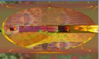
#3 Zune Journey

One person who commented on the site brought up an interesting problem: "How many computers today have the latest version of Flash? I am not allowed to install software at work."
The Zune site is Crap on a Plate — “purty” but it’s still crap. Yes, I know, it should be forgiven because it’s not trying to make money (if you don’t believe me, ask Microsoft how much profit they’ve made on Zune), but c’mon. I never want to see another “Click and Hold” message as long as I live.
Submitter’s comments: On the latest Zune commercial, this web site address is displayed: http://www.zunejourney.net/
I think the person who designed this had a little too much of an “experience” at Woodstock, and it still affects him today.
Vincent Flanders’ comments: You’re right. I’d say that it looks like this web site was influenced by Orange Sunshine, but that means you were there with me in the summer of 1969.
#2 Etsy.com (select by color)
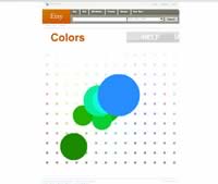
Ignorance is bliss because the downside of knowledge is pain. This site is very painful.
As someone commented: "Maybe I'm dumb or old (33 is old? dunno) or both but I have NO idea how to use this site... and when I click on things, what am I doing with them? where do they go when I "throw" them? The site made me feel like it was someone's inside joke and I clearly wasn't "in" on it. Sucky suckage of sucking suckiness."
Submitter's comments: I recently found your web site and have used your tips frequently in revamping our company's web site The downside is now I can really see how bad some web sites are.
Enjoy this rainbow colored mystery meat. It took me a bit to figure it out — play with the colors a bit, then click. It'll bring up a random (I think random) item of that color. Click on it again to maximize. If you wait a moment it'll tell you that you can "Throw" the items around.
It's sort of like a Flash lava lamp.
Vincent's comments: Etsy's home page has normal ways to find handmade items to buy. Just look at "Categories" and all the sub-categories listed underneath. Gee, it's logical. Then you have "Colors," which is the page that was submitted, and it makes no sense at all. Equally weird is "Time Machine" and "Connections." Connections seems to be a random person's Mystery Meat-based wish list. Why I would want to buy items for a random person escapes me. Most of the site escapes me.
#1 snarg
Comment #1: This is what web design under the influence of hallucinogenic drugs looks like.
Comment 2: That's it! The aliens have landed! If you click the "squeee" and then the green balls eventually you'll get two email addresses, and a message at the bottom with words to the effect: "Hello Crazy" "who are you?" "from Liek Germany 9 27 07" "hello Beautiful"
Green undecipherable text on green background. It has GOT to be aliens. Maybe Martians with the green text and all! Keep clicking the green balls...