Worst Old School Web Sites of 2008: Cops and Chiropractors

Cops and Chiropractors are both YAITS — Yet Another Industry That Sucks. I don't understand why these two industries seem to have a high proportion of web sites that suck. Cop web design, in particular, is troubling because there are many police web sites that are well-designed. Have you looked at any?
These two YAITS were placed in their own separate category because they would have dominated the Worst Websites of 2008.
2008 was a bad year for Cops and Chiropractors
I realize that the real job of the police is to "protect and defend" and not "protect, defend, and design web pages." Still. Can't you guys hire someone with some taste and talent?
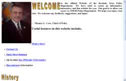
1. Martinsburg Police Department

Oh, the power and glory of police web sites. This site should be declared an endangered species because it makes about every mistake in the book starting with the TITLE “Index” and ending with Javascript loading in the status bar. It's a classic police site from 1997. I love it.
Other comments #1: Could they possibly have fitted any more swirling, twirling, scrolling, or disappearing thingies onto the page? And frames, good heavens, frames! But apparently they did it without FrontPage.
Other comments #2: Martinsburg is in the Eastern Panhandle, which has become an exurb for Washington and Baltimore. You would think a community so close to D.C. would have a site that looks professional.
2. Douglas County Sheriff's Department

Submitter comments: I have looked at some of the sites listed on your web site in the past I couldn't help but take a peek at one you mentioned — the Seekonk Police Department. That web site is bad but I may have one for you that is even worse. Check out the Sheriff's Department from Douglas County Missouri. P.S. Try to right click on some text.
Vincent Flanders' comments: Interestingly, my daughter and I were watching the latest Reno 911 DVD (background on the show) the day I made this site the Daily Sucker. It occurred to me that the Douglas County Sheriff's Department's web site is just the type of site that the Reno 911police department would have up and running.
It uses every cop cliché I've ever seen (including the theme from Bad Boys). The animated bullets being “fired” on the home page are not the kind of message you want to see on your local police department's web site. This tacky technique reminded me of one of the bonus features on the DVD — Cop Psychology Inside the Minds of Reno's Deputies.
The different officers were interviewed by a psychologist/psychiatrist and the question that was asked of everyone was “Under what circumstances do you feel deadly force is justified?” The answers are hilarious. I've provided a link to one of them and it's TOTALLY NOT SUITABLE FOR WORK (or for those folks who have a sophisticated sense of humor or are easily offended).
Just as you wouldn't want your local cops to spout the same nonsense as Lt. Dangle about deadly force, you don't want your local police web site to use animated bullets.
Douglas County is how cop sites used to look like in the old days. The problem is “these are the new days” and this site proves that police brutality doesn't always involve a billy club.
Douglas County Sheriff's web site — The original site is down. The original URL was members.getgoin.net/~docoso/
Douglas County Sheriff's web site — current version. Certainly not as bad <grin>.
Note: The site has been up and down. Just in case it's down when you visit or they change the site, please view the following:Here's a high-def video of the site with my commentary.
Here's a YouTube hi-def version.
Here's the December 21, 2007 version from Archive.org. It has just about everything the current site had except the wonderful music.
If you're into screen shots, here's a 8.36Mb screen capture that shows the page in all its "glory."
3. Clarksville Police Department

Note: The site has changed. Comments are about original site.
The fugly splash page weighs in at 1.47 megabytes. OK. What’s causing this page to bloat like a puffer fish? It’s those poisonous images on the left and right. One is 523,675 bytes and the other is 741,098 bytes. Just to show you what a nice guy I am, reduced the size of the images to fit in your height=”413" image attribute. Here is image #1 (25Kb) and here’s image #2 (48Kb) — and I didn’t really try to optimize them. Feel free to use them and cut out 1,189,578 bytes of fat from your web page.
The copyright page says “2006,” but it’s more like 1996. On the other hand, this screenshot of the unnecessary splash page looks better than the screenshot of the real home page with its centered gold and silver text. Is it possible to have a bigger logo? Yes, but I don’t want to see it.
On a positive note: At least you can read the text.
Clarksville Police Department - the current "improved" site
4. Woodcliff Lake Police Dept.

It's another FrontPage disaster. The main navigation isn't in the first screen, but about 1,000 pixels from the top of the page.
We may have the worst collection of cheap, ugly clip art on one police site. On the other hand, I'm sure there's a police site out there that's worse.
There's no consistency with the background images and the home page links on the subpages are at the bottom of the page. Yeah, I'm going to read all the way down.
5. Keokuk Police Department
Yes, it looks better than the Woodcliff Lake police department, but it still sucks. We don't need a Welcome to my web site message, but we need more professional graphics.
Oh, the latest news is a new chief of police. This occurred in 2005.
6. Carnation Chiropractic
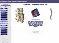
You have to love the way text is arranged on the Office Hours page and the fact there’s no link to the home page. Yes, it’s “under construction,” but still. The image of the spinal cord on the left freaks me out because it looks like a poisonous snake is going up and down the spine. There’s no reason for the animated spine on the right side and I don’t have to tell you (but I have to tell them) that cube in the middle sucks worse than a $20 vacuum cleaner.
Frames suck, but they suck even more when the links open in a new window (the few I tried). If you’re going to open new windows, you don’t need frames. The background in the left frame is ugly as are the buttons.
The list of mistakes goes on and on. Nuke it and start over.
Other comments #1: A shimmering pile of suck. Templates this bad should be taken out and shot. Rotating cubes, animated thingies, dancing babies, and the like should be in a museum. 1997 was a great year, after all.
Other comments #2: The office hours are under construction???!?!??
You have to give them credit for trying though. It isn't the scariest one I have seen, but it does look like someone who has just learned all this "makin' a web page" stuff and just hasn't gotten to the Photoshop portion of the lesson yet.
7. Proactive Chiropractic

Obviously, this site was designed on a 640×480 monitor. If you look at it on anything larger, the content runs over the border as illustrated by this screen capture. There are four screen captures of the first screen at different resolutions and four captures after the PAGE DOWN key was hit. See for yourself.
Other comments #1: Wow…Chiropractors may turn out to be the latest genre of web site purveyors that shouldn't. See: martial arts studios, architects, public schools, psychics, and Chinese restaurants.
Other comments #2: WHAT IS GOING ON WITH THE ROTATING, SEVERED SPINE!?!? Seriously. what the heck.