Ugliest / Worst Non-Profit Websites of 2009

Generally, more damage occurs when a non-profit website sucks. When a commercial website sucks, the company is hurt, but when a non-profit site sucks, the organization's clients get hurt — and they already are in a vulnerable state or they wouldn't be clients. There's more at stake with a non-profit website and they have more responsibility to "get it right."
You don't want your visitors to say, "Where do I click to save baby seals? Can't find it. Oh well, let 'em die."
Obviously, some clients of non-profit organizations, like universities, don't get hurt in the same way as a homeless shelter's clients would get hurt. Still, a poorly designed website tarnishes the luster of an organization. What follows is a lot of tarnished luster <grin>.
1. Edison Innovation Foundation

My daughter needed to get some information about Thomas Edison and the typewriter. I eventually found it, but had to print the PDF—the screen font is too small and dark for me to read.
See if you can find the article on "Thomas Edison's Type Writer." Let me know how it goes.
Vincent Flanders' comments: I'll tell you how it went. Right down the toilet. This site is one of the worst I've seen. The site is supposed to be about providing information, except they use every trick in the book to hide the information. The site was created with Flash. That's the first mistake. They're using circular navigation and then there's the Mystery Meat Navigation in the center that's about Edison's patents. I'll bet you $100 you can't immediately go to Edison's Galvanic Batteries patent.
I thought I'd be clever and use Google's site search and find "typewriter." Nope. Even Google can't find it. That's the major reason Flash sucks. Searching Flash is damn near impossible (although Google is making important strides). Oh. We also have a FlashSplash page that wastes our time. Another reason Flash sucks is it's hard to update your text. The copyright date on the site is 2006.
As I've said in Biggest Mistakes in Web Design 1995-2015, there are four reasons people visit a website:
- They want/need information
- They want/need to make a purchase / donation.
- They want/need to be entertained.
- They want/need to be part of a community.
You won't satisfy any of those wants/needs on today's Daily Sucker.
There are four reason people visit the Edison Innovation Foundation:
- They want/need to be annoyed.
- They want/need to be frustrated.
- They want/need the feeling of Web Rage (it's the Internet version of Road Rage).
- They want/need to waste precious minutes of their life they'll never get back.
Other comments #1: OMG! Why does poor Edison's head keep exploding! And why do I keep watching it explode? BIZARRE.
This is downright gross. MMN overkill. My vote for WORST site of the year!
Other comments #2: Vincent, You forgot to mention the upside down navigation!
2. Eesti Muuseumide Infokeskus

Submitter's comments: To be fair, it is in Estonian which probably won't help your brain (although once you get past the page there is an English-language version). The navigation is constantly moving up or across at random and the letters on the blocks don't even vaguely match up with the link's title. Why do that? Once you've moused over all of the options, you need to figure out where the link you've found has moved to.
Vincent Flanders' comments: Wow! Movable Mystery Meat. It's almost as bad as Random Mystery Meat Navigation. People aren't going to your website expecting to have to find the navigation. Best-selling author and animal behaviorist Temple Grandin, in her book Animals in Translation, makes the statement, "Humans are built to see what they're expecting to see." Humans suffer from Inattentional blindness and can't even see what's in front of their eyes. Your visitors are expecting to see navigation at the top, left-side, or right-side of the page. They expect to be able to read and understand the navigation.
This site also appears to have contrast issues on the internal pages.
Other comments #1: This is a "Mamma, look what I can do!" site. So now we have to come up with a new description for this type of MMN? This could take a while. Mystery Meat Navigation a la Estonia? I'm tired already.
Other comments #2: A more subtle suck: If you've got Flash turned off, the links don't move around — but they're still in Estonian, even on the English page
3. Harvard University

Vincent Flanders' comments: This is Harvard Freakin' University! They should know better.
First, Harvard University didn't understand the concepts of DNS and/or redirection:
- http://www.harvard.edu/ works.
- http://harvard.edu/ didn't work until I mentioned it, then they fixed it. Oh. I have a screenshot.
Second, and worst of all, Harvard doesn't understand the definition of contrast.
I ran the home page through AccessColor and the report said:
Both color difference and color brightness do not meet the recommended standard for 10.87% of the total text.
Either color difference or color brightness does not meet the recommended standard for 23.37% of the total the text.
Here's a screen shot of the full report. Mileage will vary because the home page changes frequently. This is a screen shot of the page I used to generate the report.
Oh. Harvard University uses Mystery Meat Navigation. I told you MMN was evil. Obviously, Harvard has turned to the dark site. You'll find it under the main picture. At least they're nice about it. You don't have to click to see each news item. They've set it up so the four news items rotate.
4. ICCM
Submitter's comments: I found this on DIGG. It was Dugg 7,852 times and there were over 1,000 comments. The headline was The Most Intense website Intro Ever.
I think it certainly qualifies and I instantly thought of you for these four factors:
- Way over-the-top intro.
- Flashturbation.
- Religious website.
- GlobeGuy would like it.
Other comments #1: That is the most awesome intro ever! If Jesus had this technology in his day, he wouldn't have needed to turn water into wine, or raise people from the dead, or multiply the bread and fish. He could have said, "Behold the awesomeness of my intro," and the Scribes and Pharisees would have bowed before his skillz and worshiped him without further argument.
Vincent Flanders' comments: Yes, it sucks like…well, I can't write the analogy because I try to be somewhat audience friendly. Nevertheless, I WANT A SPLASH-FLASH PAGE LIKE THIS FOR WPTS. I've always prided myself on my website having a somewhat tacky design. This FlashSplash is perfect. All some talented designer with a Flash decompiler has to do is replace ICCM with WPTS and change some of the wording around. Man, oh, man, I'd love to start off WPTS with a steaming, smelling pile of crap like that.
Other comments #2: That stupid, tacky, seizure-inducing Flash intro absolutely destroyed the site. That the website is INTENSE (I feel like I am getting spiritually mugged) is correct, but the site is about half as tasteful as that for your average strip club here in Houston. I couldn't find where to turn off that phony John Walsh-sounding narration. Very bad.
Well, at least these folks are not preaching about the imminent appearance of the Antichrist, the end of the Mayan calendar, the New World Order, or men in black helicopters. If their stated intent of creating a system of accountability for ministers is to be believed, then more power to them, despite their cheesy website
I have never heard of this organization (and) I am mildly disturbed by being able to apply for ministerial credentials via the Internet, stated requirements notwithstanding.
5. The Republican Party

Vincent Flanders' Comments: I hate politics so much that I don't keep up on what's going on. One site that was submitted had a link to the GOP website and so I clicked and went there.
I was surprised to see an African-American woman at the top of the Republican National Committee (RNC) home page (they rotate the images, so your mileage will vary). I was under the impression — obviously a wrong impression — that there weren't many African Americans in the party. I figured that the RNC would use more than one image and so I decided to see how many different images they used.
I decided to hit the page refresh button until I got an image that repeated. I saw nine unique images and since I'm assuming that these images are supposed to be representative of the Republican Party, the makeup of the GOP is 33% African-American men, 22% African-American women, 33% young white women, and 11% chubby white men.
Hell, even the Democratic Party isn't that diverse.
6. OSFest

Submitter's comments: Celebrating the 40th anniversary of the Apollo 11 landing… and about the 15th anniversary of when this was top-of-the-line Web page design. It's even got a modern equivalent to one of those "Top 5%" badges. Gosh, that takes me back.
Vincent Flanders' comments: Yes, it takes me back — to a place I don't want to go. I was there once, thank you, and I don't want to go back. The only thing that's right is there's plenty of color contrast. Unfortunately, the colors are ugly and you can read the text <grin>.
7. We're Worth It

There's a sad irony in the fact that what looks to be an organization to increase one's self-esteem has an incredibly sucky website. Actually, I don't have the foggiest clue what the organization is really about.
To make matters worse, the page wants to play the song "We Are The World," but according to the Windows Media Player, the file is copy-protected and I don't have the right to play it. Hmm.
If I wanted to be nice, I'd say this site is a classic example of Mistake #6 from Biggest Mistakes in Web Design 1995-2015 — "Have you ever seen another website? Really? Doesn't look like it."
They can chant "I'm worth it" until they're blue in the face, but the design isn't worth the paper it isn't printed on.
Other comments #1: OK, here goes: I'm smart enough, I'm good enough, and gosh darn it - people like me...oh wait; wrong affirmation…I'm a failure…sob…So, you're worth it? What, exactly is "it"?
Honestly, I think "meta name="generator" content="Yahoo! SiteBuilder/2.5/1.6.0_03" explains quite a bit.
Other comments #2: "Over the top" would denote a site built by someone possessing the skills to overload a site with bells and whistles. The press release page isn't even readable. This is an "Under the Bottom" site.
8. Home of Heroes

Submitter's comments: I've just started on as the web designer for my company. I've got a long list of improvements to make. I really appreciate your checklists, by the way.
For what it's worth, the page I'm submitting is beyond sucky:
Vincent Flanders' comments: Seth Godin has an article entitled, Two ways to build trust. To summarize for those KidsToday who don't like to read, "If your site doesn't look like a pro, the people will go."
For the readers out there: As far as I can tell, this site isn't a commercial site (outside of the ads and sponsors), but one of the problems with the site is that you can't tell what kind of site it is except, perhaps, an extreme example of what used to be called an "amateur" website.
The site is about "patriotism, the Medal of Honor and military history." I think America's heroes deserve better. I hereby recommend the site for court martial under Mistake #6 of the Biggest Mistakes in Web Design 1995-2015 — "Have you ever seen another website? Really? Doesn't look like it."
9. TechSoup

Vincent Flanders' current comments: Note: I just re-ran AccessColor on the home page (05/11/11) and they're down to 12.02% on issue #2 (see the comments below where you have to click). Personally, I can read the text, so it looks like they've changed enough to be readable.
Vincent Flanders' original comments: TechSoup is the technology site for non-profits and it's hugely important. I trust that if you work for a 501(c)3 organization, you're getting your technology products from TechSoup. I hope you're getting a lot of your information from them, too. If you're not, you're either stealing software, using outdated software, or somebody's paying too much.
Their previous site's design was…functional. It certainly didn't have "a real pretty mouth." What it did have, for the most part, was readability. You could easily read the text (well, 97.86% of the text). The problem occurred when you put white text on that puke-gold (#cc9900) background.
Well, TechSoup decides its time for a redesign (here's the new home page) and, while they managed not to succumb to a lot of temptations to suck up their site, they had to get artsy with their text color. I don't know why designers are in love with grayish text (#666666) on a white background. Maybe they're on Macs and the color looks great. PC laptop screens also can give a distorted view of text color.
On the day I checked out the contrast on the new TechSoup home page using AccessColor, I received the following report:
The W3C recommends a standard of 500 or greater for the color difference and a standard of 125 or greater for color brightness.
Based on these considerations, the results for this page are:
- Both color difference and color brightness do not meet the recommended standard for 0% of the total text.
- Either color difference or color brightness does not meet the recommended standard for 69.32% of the total the text. A Warning message is displayed next to the HTML source line.
Text on background with images is for 20.31% of the total text.
Like the good, pre-Vatican II Catholic I'm not, I ran a test to see what color I could make the text before it became a mortal sin (bad contrast). TechSoup uses #666666 for its text so, logically, I tried #555555. I'm a genius. It worked.
Personally, I don't think #555555 is dark enough to make text really legible. "Legally," it works, but this is 2009. Black is beautiful. Let's make black text the new black text. Let's make our text #000000.
10. Welcome to Evangel Cathedral
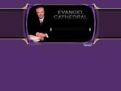
Here's another church site that has committed the sin of Flashturbation. We have a needless FlashSplash page — whoops — “needless FlashSplash” is redundant. If you click “Skip Intro,” to enter the site, you get the “real” home page, which is a whirling collection of Flashturbation that would make a Sufi dizzy.
The volume of the screaming guitar on the home page is louder than the ad. I'm confused by the “Camelot” link. It's basically an ad for a restaurant. Huh?
Back in 1969 I met and interviewed Kenny Rogers when he was with The First Edition. He was one of the nicest people you would ever hope to meet. When he became hugely successful with his solo career I was happy because nice guys can finish first, but the pictures on this site confuse me. I didn't know he became a preacher.


