Worst Web Sites 2009
Worst Web Sites of 2009:
Jan.-March Part 1
Worst Web Sites of 2009:
Jan.-March Part 2
Worst Web Sites of 2009:
April-June #1-10
Worst Web Sites of 2009:
April-June #11-20
Worst Web Sites of 2009:
July - October #1-10
Worst Web Sites of 2009:
July - October #11-20
![]() Vote For The Worst Web
Vote For The Worst Web
Design Of 2009
Group 1
Gorgeous Websites From The Late 90's To Inspire You — If You Have No Taste
Worst Web Sites 2008
Worst Web Sites 2007
Worst Web Sites 2006
More Bad Web Design
Daily Sucker
Daily Examples of Bad Web Design
Does Your Web Site Suck?
Checklist 1
149 Ways to Kill Your Web Site
Checklist 2
82 Ways to Ruin Your Web Site
Miscellaneous
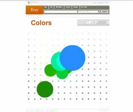
#2 Worst Web Site Navigation — Etsy.com (select by color)
 Submitter's comments: I recently found your web site and have used your tips frequently in revamping our company's web site The downside is now I can really see how bad some web sites are.
Enjoy this rainbow colored mystery meat. It took me a bit to figure it out — play with the colors a bit, then click. It'll bring up a random (I think random) item of that color. Click on it again to maximize. If you wait a moment it'll tell you that you can "Throw" the items around.
It's sort of like a Flash lava lamp.
Vincent's comments: Etsy's home page has normal ways to find handmade items to buy. Just look at "Categories" and all the sub-categories listed underneath. Gee, it's logical. Then you have "Colors," which is the page that was submitted, and it makes no sense at all. Equally weird is "Time Machine" and "Connections." Connections seems to be a random person's Mystery Meat-based wish list. Why I would want to buy items for a random person escapes me. Most of the site escapes me.