Contenders for Worst Web Site of 2009: January - March #1-13
Web design is an art. Great web design occurs when design and content are seamless and you don't notice its greatness. With great web design, it's easy to find the information you need. The content makes you want to return again and again and, most importantly, great design gives credibility to the company/organization.
2009 Was A Incredibly Great Year For Incredibly Bad Web Design
During the first three months of 2009, there were 68 Daily Suckers. I whittled them down to 27 contenders. Looks like a lot of web designers and web design firms will be busy redesigning these sites.
Every site but one, on the first part of the January-March list, ended up on at least one Worst Of list.
1. Bella De Soto's Web Site (Tie)
This site ended up #1 on Worst "Over The Top" Websites of 2009.
2. Genicap
This site ended up #14 on 2009's Worst Business Websites.
3. Control Driving Skills
This site ended up #11 on 2009's Worst Business Websites.
4. Welcome to Evangel Cathedral
Ths site ended up #10 on 2009's Worst Non-Profit Websites
5. John Titor Time Traveler
This site ended up #9 on Worst "Over The Top" Websites of 2009.
6. Leo Burnett Canada
This site ended up #3 on 2009's Worst Business Websites to Navigate
7. MIAUK
This site ended up #3 on 2009's Worst Web Sites: Honorary Winners
8. Chrysler Aspen Hybrid
This site ended up #2 on 2009's Worst Web Sites: Honorary Winners
9. MSY Technology
This site ended up #7 on 2009's Worst Web Sites: Honorary Winners
10. Dell Adamo Laptop
This site ended up #4 on 2009's Worst Web Sites: Honorary Winners
11. Jacksons of Piccadilly
This site ended up #1 on 2009's Worst Web Sites: Honorary Winners
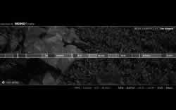
12. MONO*Crafts
Submitter's comments: I am a web design instructor and I use the examples on your site to teach my students what not to do in web design. I have a site that I think is bad. The actual graphics are pretty cool but the functionality I think is terrible.
First of all this Flash Site opens a splash page that asks if you are ready to begin. If I wasn't ready to begin I wouldn't have come to the site in the first place, doh. When you click to begin, it takes you to another Flash page with this bar, with words that you can't read scrolling across the page. When you move your cursor around, say the top of the page that bar grows and speeds up. When you try to put your cursor over it goes back and forth. By the time, I tried to do that I already had a headache.
Below the window where the bar is, there is Mystery Meat Navigation that when you click a link that is available takes you to a page that is just as baffling.
Vincent Flanders' comments: I call this type of design “WTF?” — What The Heck? I don't have a clue what this site's about. It could be an artist's site, but I can't tell. Somehow I clicked something and a message went by saying this was a “Macromedia Site of the Day.” Oh. I get it. It's FlashTrash.
13. Billy Connolly
This site ended up #8 on 2009's Worst Business Websites to Navigate