Contenders for Worst Website of 2009: January - March #14-24
Web design is an art. Great web design occurs when design and content are seamless and you don't notice its greatness. With great web design, it's easy to find the information you need. The content makes you want to return again and again and, most importantly, great design gives credibility to the company/organization.
2009 Was A Great Year For Bad Web Design
This bunch of suckers is the last of the third quarter. Out of the 13 sites listed in the first group, 12 of them went on to be "Worst of the Year." In this group, "only" 6 out of 11 made it "Worst of the Year."
Some of these sites may have been fixed or improved since they were originally listed. Let me know.
14. d/Lux/MediaArts
This site ended up #5 on 2009's Worst Web Sites: Honorary Winners.
15. Dr. Joye Pugh's Publications and Writing

Submitter's comments: This web page is very difficult to read. It has a black background with red lettering. That makes it hard enough to read but add the glowing menu and glowing links, your eyes will start to hurt quickly. There is also underlined text that is not a link.
Vincent Flanders' comments: Yesterday, I talked about web sites belonging to “Over The Top” industries. As I described it yesterday:
…an “Over the Top” industry is just like the definition of pornography — you know it when you see it. Over the Top sites generally deal with philosophy, religion, politics, etc., but they're generally not mainstream.
If you look at my examples of Over The Top sites, you'll notice that today's sucker is right at home. It's not mainstream, has TABLE borders on, red text on a centered background, underscored text that isn't a link, and the most amazing feature: glowing links. I can't remember the last time I've seen links that glow. Really impressive, When I say “impressive” I mean “sucks.”
What drives me crazy is that it doesn't take much effort to “fix” the home page. I spent a total of three minutes changing fonts and text colors and I made the home page 2000% better — which is pretty good (2.5Mb) considering I'm not a web designer. It's not beautiful, but at least it wouldn't be today's Daily Sucker. Think what a real web designer could do!
16. ABBC Breeders & AKC
This site ended up #4 on 2009's Worst Business Websites.
17. Gates and Fences
This site ended up on Worst Business Websites of 2009, But You Can Learn Something From Them (these sites weren't ranked).
18. MCI Management Center
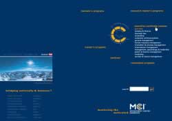
Submitter's comments: I find it hard to believe that someone at some point in time found this “cool” and paid for it. It's an Austrian university's web site
The above is the link to the English version. The German version opens a pop-up onload as an extra. So all non-German-reading visitors are really missing out! :P
The “C” metaphor of the navigation scheme is obviously derived from the logo. But just because you can doesn't mean you should! It's wrong to put the logo on the bottom right, especially
when there's so much empty space on the top left of the page!
The navigation is a set of image maps, and the whole thing is in layout tables.
I also dislike that on the home page it doesn't highlight individual links on hover, making the blocks of links look like one huge link and that the subpages are made with frames.
If you reload the page with JavaScript disabled it will show the links for Masters and Bachelors degrees. As far as I can see, you can actually reach all content without JS and images enabled, but the metaphor really loses whatever impact it might have had.
As for your pet peeve, yup, we seem to have contrast issues too.
Vincent Flanders' comments: This is the most bizarre navigation that I've seen in a long time. When you go to the German version of the site, no white menu text shows up. This is very bizarre.
I've never seen the main logo placed in this position before. On subpages, the logo is at the bottom of the page. Huh?
19. Complete Health Center

Submitter's comments: It's almost as if some people don't want people to visit their site. It's all in Flash. It has stupid animations for EVERYTHING. (Just because you can do something, doesn't mean that you should do it.)
Vincent Flanders' comments: It's a very simple concept: If your web site can be built with HTML, build it with HTML and not Flash.
What's going on with all these sites where there are videos of people welcoming me to their web site? On the positive side, when you stop the music it stops on every page. If you leave the site and come back, the blonde replays her welcome message. It would be nice if the site set a cookie so you only saw her once. Of course, most people won't return to the site.
20. Serro Scotty Camper Enthusiasts

Submitter's comments: I found this site when I used Google to find the brand of vintage trailer that I just bought. Could not believe it is for real, but the sad thing is, it is.
Vincent Flanders' comments: If there's one web design tool that's worse than the old Microsoft (Af)FrontPage, it's Yahoo! SiteBuilder. It's almost as bad as converting a Microsoft Office document to HTML. SiteBuilder offers templates for hobbyists that are pretty scary, but they're not as bad as this site.
I'm a very pale, boring, white guy and I love color, but this site takes the concept of multiple colors to a new level. Here's a screen capture of the site that shows off my new HP w2408h monitor that I'm in love with. The good news is this is what I see with the window open; the bad news is this is what I see with the window open. Could we stick with one color, two type sizes, and flush-left text? It would be nice to have something in your TITLE tag besides “Index,” and it would be great if you could mark your newsletters as PDF files.
21. Titusville, Florida — North Brevard Business Directory
This site ended up #9 on 2009's Worst Business Websites
22. Anachrome
Anachrome ended up #7 on 2009's Worst Business Websites
23. Just Like Sugar
Just like sugar ended up #5 on 2009's Worst Business Websites
24. Barnard Castle

Submitter's comments: Here's an example of an exceptionally bad web site for a town here in the northeast of England - a place called Barnard Castle. Nice little market town, but you'd have trouble determining that from the site.
The navigation is appalling, and when you do get to a page, you'll be lucky if it works at all. Getting back to the home page is hard - back button nav is your only option. Also, it's a site of a thousand styles. I couldn't manage to find two pages that looked the same. Keeps you guessing about what's coming next, though. The black/red combo also isn't very welcoming.
Vincent Flanders' comments: Well, there is some navigation on the subpages that leads back to the home page. Unfortunately, it's intermittent and we all know the perils of intermittent reinforcement — slot machines are a good example.
My main issue is focus. Where's the real focal point of the home page? It can't be the scrolling “This Is Barnard Castle Life,” because clicking the message doesn't lead anywhere. It's the same with the castle pictures.
If you look at your browser's status bar as you scroll, you'll see x-y coordinates