
Bad Web Design
Bad web design is like pornography—you know it when you see it. Unless the bad design is on your web site.
Most bad web design makes you scratch your head. As I asked in Mistake #6 from Biggest Mistakes in Web Design 1995-2015—"Have you ever seen another web site? Really? Doesn't look like it.
The following are articles that cover the topic of Bad Web Design.
Over-the-Top Websites
The definition of an "Over-the-Top" website is just like the definition of pornography -- you know it when you see it. Over the Top websites generally deal with philosophy, religion, politics, end times, etc., but they're generally not mainstream.
Many of these sites have been included in "The Worst Web Sites of 2005-12" or are contenders for Worst Web Site of 2013.
Mystery Meat Navigation

A now-defunct article had a great definition of MMN:
Mystery Meat Navigation (also abbreviated MMN) is a term coined and popularized by author, web designer, and usability analyst Vincent Flanders to describe user interfaces (especially in web sites) in which it is inordinately difficult for users to discern the destinations of navigational hyperlinks—or, in severe cases, even to determine where the hyperlinks are. The typical form of MMN is represented by menus composed of unrevealing icons that are replaced with explicative text only when the mouse cursor hovers over them.
Since Mystery Meat Navigation sucks so much, I had to divide it into six topics:
The Biggest Mistakes in Web Design 1995-2015

I've gathered what I think are the biggest web design mistakes committed during the period 1995 to 2015. Yes, it is a little facetious to say these mistakes will be made in the year 2015, but it's human nature to repeat your mistakes over and over. But it's human nature to repeat your mistakes over and over.
If you could take away one thought from the article, I would like it to be "Visitors to your web site don't care about your problems. They want you to solve their problems now.
Videos About Bad Web Design

Over the years, I've made a number of videos discussing web design. Some of them are simply excerpts from my speeches. The quality, like everything else at WPTS, varies wildly.
 There are many more of my videos at YouTube.
Gorgeous Websites From The Late 90's To Inspire You — If You Have No Taste

Recently there was an article about how popular web sites looked in the late 1990's. While it's interesting to see what Adobe or Apple looked liked back then, there isn't much you can learn from these sites. On the other hand, you can really learn from and be inspired by web sites that are featured on Web Pages That Suck — especially those from the late 90's. As a bonus, you'll feel good about your design skills because nobody ever looked at the examples on Web Pages That Suck and said, "I'm a horrible designer because I can't create these kinds of websites."
Gorgeous Websites From The Late 90's To Inspire You — If You Have No Taste
Architecture — An Industry With Sucky Websites

I don't know what the deal is with architects. For an industry that depends on accuracy and stability, they seem wildly inaccurate and unstable. They love, love, love, love Mystery Meat Navigation, which doesn't make sense because they wouldn't use this technique on their buildings. When it comes to their web sites, architects seem to be one floor short of a complete building. The ones we feature all need to be redesigned.
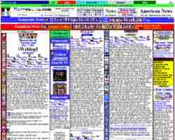
Ugliest / Worst Web Pages of the Decade

I've been writing about bad web design since July 1996 — and nobody knows more about what sucks up a site. My two books on web design showcased bad web sites and what you need to do to prevent their mistakes from creeping into your web design. Like I've said forever, you can learn good web design by looking at bad web design.
I've gone through my hell-hole of bad web sites and picked out the 30 that I think typify the worst in web design.
Still Sucking After All These Years: 15 Years — 15 Websites Stuck In Suck

It should come as no surprise that the Vatican and Richard Simmons still suck. But, as I asked in my article Biggest Mistakes in Web Design 1995-2015,"Have you ever seen another web site? Really? Doesn't look like it." How can these sites not change for the better? Didn't they notice that other websites looked better than their website? It's as if they told their designers, "Redesign our site, but keep the sucky parts."
The article features 15 websites that went from 1990's bad to 2010 bad.
Still Sucking After All These Years: 15 Years — 15 Websites Stuck In Suck
Stupid Versions of the WPTS Home Page

It always amazes me that people come to WPTS expecting to see me use "good" design on this site. It is, after all, called "Web Pages That SUCK." The mistakes I make aren't as bad as most of the sites I feature, but you should also learn from my mistakes.
I've created a number of sucky versions of the home page. Some are so sucky that you would think anyone would get the joke. Not so.