 Over-the-Top Websites
The definition of an Over the Top website is just like the definition of pornography -- you know it when you see it. Over the Top sites generally deal with philosophy, religion, politics, end times, etc., but they're generally not mainstream.
Many of these sites have been included in "The Worst Web Site of 2005-12" or are contenders for Worst Web Site of 2013.
Constellation 7
It's Jesus on acid.
NOTE: ALL THE SITES IN THIS GROUP MIGHT CAUSE SEIZURES
And here are the other members of the family - the Manson family of website design.
Galaxion – The Final Frontier
Zion Genesis
Treasureweb Public Start Page
The Seven Thunders of the Living God
The Word of God Is Jesus Christ and His Holy Gospel
The Perfect Poverty Eradication System
PSIlink: The Memory Game of the Millennia
The Mazzaroth Mission
The Afterlife
Could also be the worst Website of All Time
NOTE: THIS SITE MIGHT CAUSE SEIZURES.
Submitter's comments: I don't know what to say about this god-awful abomination of a website.
It has:
- Ungodly amounts of animated GIFs.
- It disables user scrolling and continuously scrolls upwards.
- Has an excess of excess of angels.
- There's a golden Jesus thing.
- And more.
The Slide Rule Universe
Vincent Flanders' comments: This site is a really bad Over-the-top Website looks like it came out of 1998.
Teacup Pigs Full Grown
Comments: I cannot pretend to understand what, if anything, the site is actually trying to accomplish. Still, I don't understand Polish, cannot abide such obvious keyword stuffing, and am getting a bad headache, so I will leave it at that.
Cloud 9 Walkers
Horsesh*t isn't the only thing that comes out of a horse's backside.
 Havenworks
It's pretty obvious why this site is listed here. When someone sees this site, their reaction is the same as my reaction when I first saw it — WTF? — What the Heck? Originally listed as the #3 Contender for Worst Web Site of 2008, it kept on grating on everyone's nerves until it became the Number One Worst Web Site.
I made a full-size screen capture of the site that weighs in at 37Mb. Amazingly, the web page itself weighs in at only 996.62Kb (on the day I tested it); nevertheless, it's 996.62Kb of crappy design. Have these people ever seen another web site? Another news site? A site like MSNBC.com?
Havenworks (it's now dead but this is a version from Archive.org)
Bella De Soto's Web Site

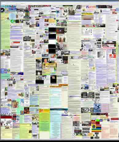
The above is a really reduced screen shot:
This website is the 2 Girls 1 Cup of bad web design. No, as far as I can tell there's no pornography, just a web site that makes the 2008 Worst Web Site — Havenworks (it's now dead but this is a version from Archive.org)—look like CSS Zen Garden.
The home page is HUGE. In fact, I don't know how large it is because it's still downloading and it's 2:00 a.m., and I'd like to go to bed. I'm guesstimating it's around 503Mb. That's Mb as in Megabytes.
The page scrolls HORIZONTALLY and VERTICALLY. Holy, mother of God. This is a nightmare.
Here's a partial screen capture
Here's a partial screen capture at a larger size
The site has died. Originally, it was at http://www.belladesoto.us/
 George Hutchins for U.S. Congress
This site left an imprint on my retinas before I could close the browser. I'm scarred for life.
I'm going to steal from one of my contributors when I say, This site is so bad, it simply cannot be "fixed," that is, without the aid of a flight of F-4's armed with napalm. Here is this site in the process of being fixed.
Through all the mess on the site I discovered Hutchins is a Republican. I figured Hutchins had never seen the RNC web site and I was right. It's much better than his site, but all that red on the RNC home page scared the bejesus out of me.
 Burlington Ufo and Paranormal Research and Education Center
I think there are two possible reactions to this site. As the great movie reviewer Mr. Cranky has said:
- “This is so godawful that it ruptures the very fabric of space and time with the sheer overpowering force of its mediocrity.”
- “Proof that Jesus died in vain.”
 Association of International Glaucoma Societies
Submitter's comments: Between the operatic "Glaucoma Hymn" that downloads and plays soon as you come to the main page (with no "Stop Playing!" button), the bobbing heads of (what I presume are) the AIGS Board in the upper-left hand corner, and no clear explanation of what this organization DOES on the main page.
Vincent Flanders' comments: I generally only agree 100% with the submitter, but in this case I agree 210%. What were they thinking when they decided on creating this music? What about the horrid use of frames? What was the meeting like when everyone said, "This rocks"? I'm just stunned.
They've changed the site (very little).
![]() YouTube video of how site originally appeared.
YouTube video of how site originally appeared.
![]() Video of how site originally appeared.
Video of how site originally appeared.
Association of International Glaucoma Societies (their somewhat updated web site)
 Accept Jesus, Forever Forgiven!
This site was the fourth worst web site of 2006 and winner in the category "Jesus Hates Our Web Site." It's a classic example of everything a web site shouldn't be. As one commenter stated:
I've been round and round a succession of appalling pages with a collection of backgrounds that are presumably for sale on "Backgrounds from Hell" and never managed to find my way back to the original page.
Something in the page caused my mouse to throw a fit and I had to shut the machine down to get it working again. However, the site has a guestbook with favourable comments about how cheerful it is, so the visitors obviously love it and, despite what I think, it does fulfill its purpose as a religious site. The first thing everyone says when they open that page is JEEZUS!!!!
 Haiti News Network
It's Christmas in Haiti! A Haitian News Network site. O….M….G. Mother Mary save us!!!!
If you're one of those folks who think that the glass is half-full, you'll be comforted by the thought that web design in Haiti has nowhere to go but up. I'm not sure which of the following two statements from the great movie reviewer Mr. Cranky applies to the Haiti News Network:
- "This is so godawful that it ruptures the very fabric of space and time with the sheer overpowering force of its mediocrity."
- "Proof that Jesus died in vain."
Wait. I know which one is the right phrase — It's the black hole of f**cking death.
 The Light of God Ministry
It's bad and it's bonkers. I actually struggled to find a 'How to tell if your web site sucks' rule it doesn't break. I guess there isn't a FlashSplash page. Oh, and no Mystery Meat Navigation (although it is almost unreadable), but other than that, it's a pretty full house.
My favourite quote from the site is from the real truth about god' page, 'God is coming – and he is mad;' — probably mostly about this piss-poor web site.
The left and right columns of text are centered, while the center column text is flush left. For some reason, it just seems funny in an ironic way.
BTW, the site says the 7 years of tribulation starts December 14, 2012. I hate to break the news, but according to the History Channel's shows (about Nostradamus and the Mayans), the world is going to end on December 21, 2012. I guess if you have accrued vacation time, you might want to plan to use it up before then <grin>.
 Surviving Niburu
The History Channel has been running a bunch of shows (which you can buy on DVD) about how the world's going to end in 2012. Here's one and here's another. Basically, here's the core of the story:
It is a doomsday that is foretold in The Mayan Calendar, the Chinese oracle of the I Ching… even an internet-based prophetic software program: December 21st, 2012. Is there any truth to the prophecy that the world will end on that specific date? And why do so many oracles throughout history seem to point to that same dreaded doomsday?
Maybe the world will end in 2012. If it does, it will be because of all the sucky web sites about predicting the end of the world like today's sucker.
 Space Ark
The person who sent this site in said:
To start, I used to be a writer for science fiction magazines, and I've seen some really godawful Web sites for science fiction authors, fans, magazines, and conventions in my time. I submit one that gave me flashbacks to 1997...
It is just me, or is the universe trying to tell me something by my seeing this site just after the tenth anniversary of the Heaven's Gate suicides? If I didn't know better, I'd suspect that the Heaven's Gate crew designed this site...or that the author thought that using the Heaven's Gate templates were a great way to sell his book.
 Jesus Christ is the ONLY way to heaven!
WWJDIHSTWS? What Would Jesus Do If He Saw This Web Site?
Whenever I see seemingly religious web sites like this one, the number 1135 comes to mind. That's 1135 as in John 11:35 — "Jesus wept."
 Celibacy, Meditation, and Enlightenment
If you are going to have a site this controversial, at least employ decent web design.
I thought this was a Buddhist-based blasphemy, but it turns out the top section changes religions. I'm not sure how often, perhaps daily. Right now, it looks Christian.
 John Titor Time Traveler
There's a lot of consistency — blue headlines are centered, red links are flush left, text is generally white. OK, OK, I'm stretching a bit here. I looked at the source code and there's no CSS, just FONT tags. It would be difficult, but not impossible to fix this site. It isn't as easy as the site I “fixed” the other day by changing a few tags. There also seems to be a gaping hole at the top. Wonder what is supposed to be there.
 Happeh Theory — NSFW!
Seriously ugly. I hate to admit it, but I am a bit afraid to venture beyond the home page...OMG..this MUST be a joke.
Whether the author of this site was playing a joke on the world, or was serious, one thing is very clear; he must not really care about getting the message out, as he spent so little effort in simply making the site attractive. Even if you are a cast-iron lunatic, people will take you much more seriously if you make your point in an attractive fashion.
 Time Cube
Just visit it. You'll see. Or if you want a real explanation:
A. Nearly the longest page in the world.
B. Too... Big... Text.... Can't..... Read.....
C. Pretty colored text. Ew.
D. Too much more. Just look.
Note 1-1-13: The site is dead and leads to an ad for an adult website. Here's a 40Mb screenshot. The only way you can visit the site is to look at it on the Internet Archive. The site was important/intesting enough to make Wikipedia, which provides a nice explanation.
Time Cube (as stored on the Internet Archive)


