Worst Websites of 2012: They Should Know Better

These websites are not your usual mom-and-pop operations. Each of them has flaws that are, to the say the least, surprising.
In this day and age, asking people to register before they can use your site isn't done. Not even on ecommerce sites.
If you're promoting conferences about going digital and the importance of mobile and smartphones, you should have a mobile version of your website. Navigation, lack of contrast and infinite scrolling are other design items websites should know better than to use.
1. Zulily

Jeez. In this day and age why are we forcing our visitors to register? Even the silly Fab website stopped doing that and you know that they're on the cutting edge of trendy. Stop it, already.
Submitter's comments: You have to sign up to see their store? WTF?
Vincent Flanders' comments: This “feature” is becoming more and more common with Flash Sale Sites. No, not those silly concoctions using Adobe Flash, but Deal-of-the-Day or Deal-of-the-Next-Three Day Sites.
Generally, with these types of sites, you can find out more details by going to the bottom menu. In this case, “Brands We Love” shows you the type of products that will be on sale.
I'm more concerned with the inconsistent link color on the home page. “Read more about us” is a link, but “great savings” and “Discover” and “Featuring” aren't links although the text is the same color.
The same color confusion holds true on the “Brands We Love” page. The text in the section “Check Back Soon”is the same color as the link color in the “Brands We Love” section (#333).
It's confusing. Although it's not a Daily Sucker in the classical sense, it's mediocre web design (but not as mediocre as this site <grin>).
Other comments #1: Lots of non-commerce sites do the same thing, try to make you sign up to look at their content, but without charging for it. No, I don't want my inbox overwhelmed by your "affiliates" fabulous marketing offers. If I want to sign up, which is not often, I'll use a throwaway address; otherwise, I'll just skip the site. Their loss, not mine. Many other places to get the same content, elsewhere.
Oh, and for those of you geniuses who use cookies to restrict monthly site views—I am looking at *you* New York Times—it is a simple matter to erase the cookie and continue on one's merry way. So, what have you accomplished? Not protecting your content, but merely pissing people off. (And, for what it is worth, I actually subscribe to the hard copy NYT…it's the principle of harassing signups that matters.)
Other comments #2: I suppose the thing that bothers me the most about this site is a certain confusion about the identity of their intended audience. Could it be moms (babies and kids don't normally shop online)? If so, then I am forced to wonder if moms have the time or inclination to jump through so many hoops just to look at and possibly buy stuff. The moms (with kids and/or babies) I know certainly don't.
2. Digital Hollywood

Submitter's comments: This is a site for a digital marketing conference. It is full of fail.
Vincent Flanders' comments: While it's correct to say this site is full of fail (massive fail), the site is far worse than that. The conference is about “Media Disruption – From Tablets and SmartPhones to Connected TVs” and there's no Tablet or SmartPhone version of the website. Duh Freaking Duh.
Also, the web version is a joke that's only 5 degrees of separation from Constellation 7. If you look at the home page on a large portrait monitor, you'll see the page is more cramped than the people on Survivor. There are text contrast issues, the text is small, it's difficult to tell where the links are located and when you find many of them they say “Click here.” The ultimate in non-helpfulness. Your links are supposed to tell you where you'll end up. There's a lot more fail, but it's Tuesday and I don't want to depress you. Check out my article Does My Web Site Suck? Checklist 1 for a lot more possible mistakes.
The fact that these important media people don't protest this abusive design makes me wonder whether or not they have any aesthetic taste. Oops. I forgot. These are media people. Disclaimer. My father and sister once worked for McGraw-Hill (the people who, I believe, are putting on this conference). There goes my career in showbiz.
Other comments: That thin horizontal striped background... Reminds me of very late '90s. Also very cluttered site. Also, I looked at the source:
<meta name="generator" content="Adobe GoLive 4">
Yeah.
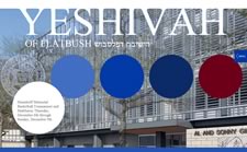
3. Yeshivah of Flatbush

Submitter's comments: Here's some Jewish Mystery Meat Navigation (MMN) that's definitely not kosher.
Vincent Flanders' comments: MMN is never kosher; it's trefah. (I hope this is the right term. I'm such a goy. I apologize in advance.) What's really narisch, is the logo on the subpages. When you click on one, you're sent back to the MMN home page. This is idiotisch.
The fly-out menu on the home page made a little sense back in 2000-2001; it makes no sense today. To prove that I'm a goy's goy, I was going to complain that the menu was on the right side. Then I realized that Hebrew text is read from right-to-left. Obviously, the text on this site is in English but its placement “makes sense.”
As far as the use of MMN on this site—Farschemn.
Other comments #1: Happened to have my mouse pointer on one of the MMN bubbles (the second one to be exact) while the page was loading and never bothered to move it. Freaked me out when the pictures rapidly scrolled down to the one it wanted.
Beyond that, it's not too badly designed.
Other comments #2: I do get the idea, but the execution is rather overwhelming. The problem here, as I see it, is that the visitor's focus is quite literally torn from one place to another, or thought of differently, it is smeared all over the page; if the entire background moves, it is very disorienting. Please tone it down.
4. Rice University School of Architecture

Submitter's comments:. I came across this hot pink beauty that is slow to load, horrible to read, and all around miserable for the end user to experience. I'm sure you will not be surprised to learn that it is an Architecture site, but I thought I would share. Keep up the great work! :-)
Vincent Flanders' comments: I was impressed that Rice University not only has their own mobile app, but their website works on a mobile phone—even without using HTML5. Apparently, I was under the mistaken impression that HTML5 was necessary to use the Viewport tag. I sit corrected. On the other hand, the school of architecture is not impressive in a positive sense.
The site has no mobile app or even a mobile version. That's the least of its problems. The most serious is the contrast clash of the flaming pink color with the white links below. Your eye is immediately drawn toward the pink section with the school's logo. Then, when your eyes go toward the text your eyes blur momentarily. There must be a scientific name for this, but I don't know its name.
We also have Mystery Meat Navigation toward the bottom of the page in the Publications section. Maybe these book titles (when you can read them) mean something to other architects, but I can't be sure.
The home page is HUGE. It clocks in at 7.1Mb. Not only is it fat, but it's slow. It takes over 3 seconds for the first byte to show up and then takes an additional 3.5 seconds to start to render. The page takes 44.5 seconds to fully load. Here's a waterfall of the page (this link is the same as the one above) showing what's wrong. PageSpeed is not impressed with the way the site is constructed.
Rice isn't alone. Lots of architectural websites suck. Check out Architecture — An Industry With Sucky Websites.
Other comments: *Sigh.* Another very typical architecture site; nothing particularly appealing about it. Has the word "functional" totally disappeared from the architectural lexicon, or is visual appeal the only thing that matters? The color choices are pretty hideous, but that at least can be attributed in some measure to personal taste.
5. iTunes Preview

Submitter's comments: I can read it on my laptop, but not on my office monitor.
Vincent Flanders' comments: You can read it on your laptop because you can easily tilt the screen and because the laptop's screen is a lot closer to your face than your desktop's screen. The page's background color is #fff and the text color is #898989 which, according to the Colour Contrast Check, fails the WCAG 2.0 contrast ratio formula as shown below:

If they can't read it, people will leave it.
Other comments: Light grey text on a white background is a gateway drug to poor design and usability.
6. Pinterest

Yeah, yeah, yeah. I know. Everybody wants their site to be the next Pinterest so infinite scrolling and using Masonry with jQuery is all the rage. Well, Rage Against The (Trendy) Machine.
Submitter's comments: This website seems to love the Never Ending Scroll of Death. Pinterest is a social networking website that seems to cater to middle-aged women. You can share and comment on various things like shoes and clothes, but all I see is a bunch of crap loaded onto one extremely long page. Crap and social networking sites go hand in hand, but this is really bad. All that is missing is some obnoxious Flash.
Warning: Scrolling down the home page of this website could cause vertigo and nausea.
Thank you for considering this site. I actually have friends who think that Pinterest is great.
Vincent Flanders' comments: I'm definitely not Pinterest's target audience. Our submitter says the site caters to “middle-aged women.” Om Malik of Gigaom says “It is especially popular with young women.” Of course it is. That sounds better to investors. Either way, this site represents the pinnacle of achievement for Over-The-Top websites.
The only difference between Pinterest and Dreams of the Great Earth Changes is the quality of Pinterest's web design. Initially, it looks gorgeous—and it is—until you start to focus. Then it becomes a long, blurred jumble of scrapbooking, inspirational quotes, cute animals (Cute Overload comes to mind), food and pastries, and—well, just look at the site.
I can't stress enough how impressed I am at the quality of the design. However pretty the pictures and layout, it's still an extremely long (61,250 pixels on the day I looked) crazy quilt of material. It's a very beautiful mess, but it's still a mess.
Other comments #1: Worst part is that annoying popover that follows you down the page. I hate that crap.
Other comments #2: Ah, the Sisyphus Scroll. One of the many unpleasant ways of AJAXing off. Otherwise, a very attractive site, although I still fail to see the point.
7. This is Scunthorpe

Submitter's comments: Scunthorpe is a town in the north of England. The website is run by the media group which produces the weekly newspaper for the area. It had a major revamp a couple of years ago when they decided that what the town really needed was a long, scrolling, box-laden, vomit fest of a site designed to make casual viewers wish for blindness.
“Features” include:
- a lag when scrolling caused by the interminable boxes
- links themed with a rainbow of good taste
- missing images (I didn't see any but I didn't try too hard <grin> – vf)
- random shop adverts and news stories strewn everywhere
- links which wander off onto other domain names e.g. try announcements
- links which go to the wrong site e.g. try announcements, then Scunthorpe Telegraph Announcements, then try to get back, you will likely end up on thisisgrimsby instead.
- less than intelligent positioning of “useful links” and “most popular” stories.
I could give other examples…
Vincent Flanders' comments: Ah…Scunthorpe. What a problem you are. The site uses a strange variant of Mystery Meat Navigation that I'll call color-coded MMN. Most of the little sections on the home page have colored bars on the left side. These match up to the colors at the top and bottom of the page that's called “Today in Scunthorpe.” Who is going to remember this system? Why would anyone in their right mind want to remember it?
One of the perils of this silly system is you put the wrong color code on an item.
The home page takes forever to load—even in England! The load time is 11.742 seconds in London(the first byte is 0.251). Ironically, it loaded faster from Washington, D.C. 8.846 seconds (but the first byte took longer at 0.383).
Other comments #1: Darn it; another nice idea gone bad! Everything down through the multicolor navigation bar looks just fine to me.
Other comments #2: The content area, however, makes me think of the ramblings of a severe manic-depressive. Rethink your content area folks, and this would be a MUCH better site.
I think —I am not sure--they are intermingling news stories and adverts. That is, it appears that some of the adverts are disguised as news. The entire look is jumbled and off-putting.
8. Marvis Contemporary Toothpaste
Submitter's comments: Marvis is an Italian toothpaste company. My wife found the brand and bought me a tube of the licorice flavored paste just for fun. It's good paste, but the site is (quoting my wife) “Neat, slow, pointless.” There's Mystery Meat Navigation too! After what felt like a waste of 30 minutes of my life spending time on the site, I left feeling a little like I just played the 90's game Myst, but I didn't accomplish anything at all.
Vincent Flanders' comments: There's an option for a low- and high-bandwidth version of the site. They both seem high-bandwidth to me.
It's a typically overwrought Flash site. The time you spend clicking around is not rewarded by useful information.
Other comments #1: I brush my teeth quicker than these pages load.
Other comments #: In real life who would actually wait that long for a toothpaste ad to load?
9. Mercia Tourist Board

Submitter's comments: It is meant to be a site about history but it has all that unnecessary, jarring gumpf.
Vincent Flanders' comments: I had never before run across the word “gumpf.” Love it. Gumpf means “random junk.” I think this site is a subset of Over-the-top Web Design. There are OTT websites that have a consistent theme and then there are Gumpf OTT—or GOTT websites—as in “Mein GOTT.”
There's way too much crammed on one ugly page. I'm not sure they've licensed the likenesses of Clint Eastwood are Arnold Schwarzenegger. The page is just plan horrible looking, which is a shame because I really liked the Anglo-Saxon English class I took and to have these representatives screw it up is a bit sad.
Oh, the site is mildly NSFW (I think), but it depends on how politically correct your company is and how much bathing suits offend. On the other hand, there might be worse pictures. Dunno because I have no reason to stay on the site.
Other comments: This site is just plain tasteless and very poorly done at that. An unattractive color palette, numerous poorly "PhotoShopped" images, a disorganized page that goes on forever - you name it. The only positive points are that they didn't seem to bother to use some crappy Flash animations.
I don't give a tinker's cuss how many visitors your site may have had (porn sites get a lot of visitors too, but that doesn't make them any less disgusting). This is one awful website.
10. Water Services Ltd.

Submitter's comments: So I'm doing some research that, for some reason or another, induced me to look up the effects of organophosphates on corrosion rates of metals. Pretty dry stuff, and typically pretty dry web pages. No problem, that. Until I came across this page.
Their main page isn't any better, and the company's home page is just about a tacky as can be, with the benefit (!?) of cheesy foreground music (It's too annoying to be background music).
Presented for your amusement.
Vincent Flanders' comments: The least problematic aspect of the site is its use of Flash. Flash for building websites is dead, dead, dead. Flash is for games and high end video. It will never come back to life, so don't get your hopes up for Zombie-Flash.
Among the major flaws we have Mystery Meat Navigation, sound files that automatically play when you enter a page, and serious contrast issues. The site is a major contender for Worst Website of 2012 and only a major redesign will keep it from the list. Just for grins, I searched "water services" on Google and came up with CleanWater Services. Even with the cartoon, it's infinitely better than today's sucker, which will end up on Over-the-top Websites.
I love the fact that turning the music off on one web page doesn't turn it off on others.
Other comments #1:This site is really, really, really bad. Specialty chemicals, huh? Somehow, it seems that these folks confused certain psychotropic drugs with water treatment chemicals.
In my worst nightmares, I never imagined that someone would try to pass off a train wreck like this as a serious commercial concern. This site should be damned to Internet hell forthwith.
Other comments #2: I am fascinated with the warrior. The shield with the eagle on it looks American, but it bears the acronym SPQR, meaning the Senate and People of Rome. The broadsword and the spiky greaves are not Roman. I wonder what it has to do with whatever it is they do.
Nobody mentioned anything about the lovely contrast of the text on the organophosphorus page.
Click on the link Our Company. Try to figure out who they are or what they do, or where they are located.
Other comments #3: I can't be the only person here who just KNOWS that this monstrosity is going to end up on the "Worst Websites of 2012" list when the year is over.
11. Carol House Furniture

Submitter's comments: I've been into Carol House Furniture before and they have really nice stuff. In fact, their slogan is “because you like nice things.” Their website, though…well, let's just say that it's “because we like web pages that suck” and lemme tell ya, it does!
Vincent Flanders' comments: When I went to their home page I discovered it was really a splash page–a splash page I couldn't read because there wasn't enough contrast between the text (#999) and the background (#FFF). Clicking the “Enter” button opens a new window and takes you to their Flash-based website. When it comes to websites, Flash is dead, dead, dead. The page also has two people talking at me. Nobody goes to a web page to have people talk at you. The top menu is not easy to read because the first line also lacks contrast.
If you click “Furniture Selection” and click “Bedrooms” and then “Bedspreads” and finally click “California Kids,” a new window opens and you're taken to the California Kids website. The navigation is confusing.
Other comments #1: Complete fail on this one, folks. This sort of site was clever many years ago, but not now.
I don't like the fact that the splash page keeps its own window open all the time and then opens up the Flash site (with that rather creepy purple color palette) in a totally new window (with everything disabled). Who wants that stupid splash page always open?
I hope your print ads don't look this bad.
Other comments #2: "If you have pop up blocker you'll have to turn it off to view." Another site that wants ME to accommodate THEM. *click* outta here.
Other comments #3: That was exactly the comment I was going to make - I have a popup blocker on for a reason, and if I have to take the time to turn it off to even enter your site?!!! No thanks.