The Worst Web Page In The World

You would think it would be easy to say which is the worst web page in the world. Well, bad web design is a lot like pornography — just when you think you've seen the worst page, along comes something worse.
The difference between the sites listed here and those found in Over-The-Top Websites is that the pages listed here belong to commercial businesses or educational institutions. Over the Top sites generally deal with philosophy, religion, politics, end times, etc., that are out of the mainstream.
Because so many architectural firms have sucky web sites, they have their own category — Architecture — An Industry With Sucky Web Sites.
NOTE: The sites are not listed in the exact order of their horribleness.
Yvette's

Submitter's comments: After seeing this site, my engagement is off! I now totally, absolutely, 100% vow a life of celibacy.
Vincent Flanders' comments: I remember the priests and nuns at my Catholic grade school telling us that if we thought we were facing immanent death, we should say an Act of Contrition and our sins would be forgiven — or something like that. After viewing this site the only thing that's keeping me alive is the thought of death.
You have to love the keyword stuffing that's going on. Most people try to hide the fact. Because of all the color combinations on the page, they just put the keywords at the bottom. You must click the ENTER YVETTE'S link to see the home page. OMG.
Yvette's (Dead but a working copy is at Archive.org.)
Sprint: Plug Into Now
I'll give them credit. Somebody knows how to use Flash. Unfortunately, it's an ADHD cesspool. I was a little surprised to hear a voice say, “Feel free to touch it” and a little disconcerted to discover that the #11 search on Google (at that moment) was “brad pitt tattoos.”
It took me a bit to figure out where the important link was located. This link took me to another Flash page, which was also strange, but it had information about how to get mobile broadband. My main reaction is “Huh?”
Mr. Bottles

This page has a little too much fun with all of the Flash toys. It'd be a clever layout if a floating man didn't start talking to me, a bunch of pictures started flipping frantically, and a little boat followed me as I scrolled.
I don't want web page avatars talking to me.
Tampax
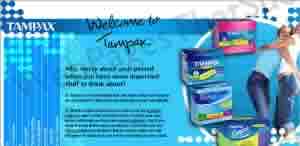
After you go through the nonsense of selecting your country (don't get me started), you'll see that the main navigational menu is at the bottom, and the captions read vertically in the UP direction. You have to lay your head on your left shoulder to read them. This is the first time I've ever seen this awfulness.
Of course, they fixed it, but you can see it in action at Archive.org
Here's my YouTube video discussing the issue.
Tampax current site.
Cafe Intl

Somebody got Flash happy and wanted to show off all the little tricks they learned. To appreciate the madness, you have to choose one of the moving items — Breakfast, Lunch, Catering, or Specials. Then it gets interesting. Using IE 8, every spot on the floating billboard filled up with shimmering information (you have to see it to understand). Using IE 7, I only got a couple of menu items if I clicked the billboard. With Firefox 3.5, I couldn't get the page to load and with Safari, it loaded correctly. That's the problem. When it loads correctly, you get a case of the dry heaves because the shimmering text gives you vertigo. Here's a video I made of the site. This is the link for YouTube fans.
What amazes me most is that somebody — or a group of people — signed off on the site. Maybe they all took that new brain pill from Greece — Blakeia.
Leo Burnett Canada

Submitter's comments: I teach Creative Advertising Strategy and Direct Response Advertising at a university. In class, we look at webpagesthatsuck.com to learn what not to do, just as you suggest and it is quite helpful. However, my students never fail to point to web sites that are highly regarded, such as Leo Burnett, that utilize Mystery Meat Navigation and flying navigation.
In fact, this Web site REALLY DRIVES ME NUTS! When you click on “skip intro,” for example, it seems that it is not an option. What are those flying apples all about anyway? Please take a look at this site. I would really like your opinion, as my students are telling me that Burnett's site is avant garde when I think it is ill-conceived.
Teacher X Press
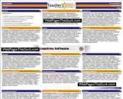
And we wonder why our children are confused?
I've heard of web designers being <DIV> happy and <SPAN> happy, but this site is a perfect example of being link happy. Or link crazy. If I counted correctly — and that's a pretty big "if" — there are 1,061 links on the page.
On the other hand, the copyright date is 2002. As I've always said, if you use dates, keep the dates current. If I see an article dated 2003, I'm going to ignore it — no matter how good it is or how relevant. It's old and old is a sin on the Internet. Wait a minute. Under that definition, I'm a sin.
Sadly, TeacherXpress' current website was suspended in 2011.
LingCars.com
I found another shockingly bad site that you might be interested in. Have a look at your leisure.
I think we have another sure-fire contender for the Worst Web Site of 2009. It's 4.3Mb of flashing, blinking crap.
Tracy's Karate

It's a YAITS (Yet Another Industry That Sucks) — Martial Arts web sites. A blast from the past is Seneca Tae Kwon Do.
It's a mess. Ditch the site and redesign it.
Vincent Flanders' comments: This site is an stereotypically bad martial arts site. You have to love the "put everything on one page" mentality. Because there is so much text, I didn't notice the "Click here for a simple navigation page" link. Duh. Why isn't this the home page and the current home page a link called, "Click here for a stupidly complex non-navigational page."
The Splash/Home page, with the TITLE tag "Home," enjoys multiple text sizes, multiple text colors, and centered text. The "real" home page likes color. Lots and lots of color. Some of the subpages (FAQ) are missing images.
DRM Guide to Disability Resources on the Internet
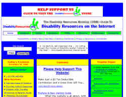
Submitter's comments: Irony of ironies: a disabilities web site that is spectacularly ill-suited for people with vision problems like color blindness. (Warning: If you are not blind now, you will be after viewing the site. Wear welding goggles.)
Vincent Flanders' comments: Well, actually, it isn't “spectacularly ill-suited for people with vision problems like color blindness,” it's just butt-ugly. I ran the home page against Visicheck's color blindness simulator for both deuteronope and protanope color blindness and then checked the results against AccessColor for contrast issues and discovered:
4.68% failure for both color difference and color brightness for deuteronopic color blindness
3.28% failure for both color difference and color brightness for protanopic color blindness
0.00% for the regular web site.
On the other hand, either color difference or color brightness does not meet the recommended standard for 6.56% of the total the text for the regular site. The deuteronope version's failure rate was 3.51% and the protanope version was 0.47%.
The text is also tiny, but you can resize it by typing CTRL+ but the colors are soooo horrid.


