Son of Web Pages That Suck

Chapter 4: Design Issues Even Martians Should Know
I always like to say, "There's a finite amount of intelligence in the universe, but an infinite amount of stupidity." In particular, there are an infinite number of ways to make your Web site "stupid." Some people think that you can only have a Web page that sucks if your graphics, text, and navigation are bad. Sorry, Charlie. Many issues that can really screw up your Web site have nothing to do with pictures, words, or directional symbols. In this chapter, we'll take a look at other ways you can go wrong. I'll also include a link that's worth the price of the book-and then some.
Big Picture Issue #1 — Web Design Isn't Sex

I've tried many ways to convey a simple message and sometimes I feel the message is not getting through. Maybe a sexual analogy will work. It seems Web designers are confusing the Web world with the real world. In the real world, foreplay is mandatory. You have to set the mood, you have to be gentle, and you have to entice. But in the world of the Web (at least those sites where the focus is making money or disseminating information), there's no place for foreplay. It's not necessary. It gets in the way. To put it bluntly, the Web is "Wham. Bam. Thank you Ma'am."
People don't need to be enticed or put in the mood when they visit your site. As we learned in the last chapter, they're at your site to solve a problem, and the sooner you give them what they came looking for, the better. Visitors don't need splash pages, Flash pages, Mystery Meat Navigation or whatever silliness you think will put them "in the mood." They want what they want NOW. "Give me your information. Sell me your product. Thank you, ma'am."
The Pointer Sisters once sang about wanting a partner who had a "slow hand." Can you imagine the following line about a Web site: "I want a page with a slow load"? Not really. Web design is about getting people what they want as quickly as possible in a way that they'll buy your product, your service, or contribute to your cause. (Some non-profits may be an exception- some mood setting may be necessary. You should know the difference.)
Just as we've all been told not to confuse love with sex, we should also remember not to confuse Web design with sex. Web design is about making money for the designer and, more importantly, the client.
As I've said before and will say again, there are sites where you want-not need-to create a mood or entice visitors. Typically, these are movie, music, and other types of sites where no one is going to get fired because the Web site "didn't make us any money." These sites are wonderful to work for because there is no accountability.
Designers often get confused about another aspect of Web design - "borrowing" design elements from another site. They hope they won't be held accountable for their actions. Perhaps that's because they're designing under the influence.
Big Picture Issue #2 — Desiging Under The Influence (DUI)
Part of the charm of the World Wide Web is that you are just a few clicks away from tens of thousands of creative individuals whose work you can see and read and draw inspiration from. Web designers are also just a few clicks away from grabbing someone’s creativity and passing it off as their own. There’s a thin line between being influenced by what you see and designing under someone’s influence.
It’s no secret that people are influenced by what they see on the Web. Back when I started surfing the Web in 1995, one of my first influences was the National Center for Supercomputing Applications (NCSA) at the University of Illinois at Urbana-Champaign’s HTML Beginner’s Guide.
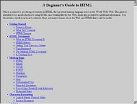
If you look at the top-right corner of the screen, you can see from the scroll bar that this page goes on and on and on.
The designer put every current HTML element on a single page. It was as if the term “Web page” meant just that—everything had to be put on one page.
YOU KNOW THE DESIGN OF YOUR WEB SITE IS A SUCCESS WHEN PEOPLE CALL OR E-MAIL YOU TO COMPLAIN:
- It's too easy to find what I'm looking for on your site.
- Your site loads too quickly.
- Your site is too easy to navigate.
- Your site is too informative
This is so important we have to say it again. Your goal is to design your site so visitors can complain about these four issues.
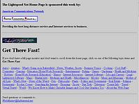
As the figure to the right demonstrates, I obviously was influenced by the look of the HTML Beginner's Guide because my page also goes on and on and on. Although I didn't have as much material as the University of Illinois, I managed to make a completely useless page-even by 1995/6 standards. "You design what you see" is a phrase I've heard through the years. If this is true, I won't tell you what influenced the first version of WebPagesThatSuck.com (See below)-no, it wasn't an S&M bondage site.
The 1996 Look of WPTS
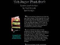
By 1998, I was pretty fed up with all the bad design I'd seen, so I thought it would be funny to put as many sucky techniques on one page as I could. What you can't see in the figure below is the sliding blue screen that made the page even tackier than it looks here.
The 1998 Look of WPTS
Too Close for Comfort?
The problem isn’t letting other sites influence your design—it’s letting other sites influence your design too much. “But Vincent, didn’t you say in an earlier chapter to ‘follow the leader’ and do what they do?” Yes, I did. There’s a big difference between putting your main navigation bar at the top of the page and your subnavigation on the left side and directly “borrowing” the look of Amazon.com’s navigation (see Figures later in the chapter). This section looks at some sites that may have slipped over the edge of acceptable influence. I say “may” because there’s really no way to determine which site is the one influencing the other.
There are several reasons one site may look like another:
1. The same design firm may have been used on both sites.
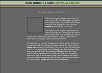
2. Both sites may have used the same design template. Dreamweaver, the Web design editing package from Macromedia, comes with many downloadable templates. The Figure below shows a band site template.
Macromedia's Band Site Template
3. A site may have received permission to mimic the look.
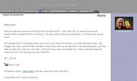
4. A site may be a parody of a more famous site. There are many sites that sell or give away templates. The figure below shows just one of the templates sold by Project Seven.
Project 7's DP7 template
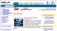
The figure above shows the site of someone who bought and used the template.

Old version of FixingYourWebsite.com
Design Level Over 80%
In some states, you're considered to be driving a vehicle under the influence if your blood alcohol level is .08% or greater. The following Web sites may also be over the legal limit of design influence-80 percent. Once again, it's difficult to know for sure the reasons for the similarities. Maybe we have designers who use the same design on multiple projects; maybe we have some serious template use; or maybe it's worse.
Amazon.com Variants
In Chapter 3 I mentioned that designers should "Follow the Leader," to take advantage of proven design strategies and provide site visitors with a familiar interface, and one of the leaders I used as an example was Amazon.com. Unfortunately, some sites have done a lot more than follow Amazon.com.
Amazon's gone through a whole series of design changes. The figure below shows the site as it looked in late 2001.

Amazon.com October 27, 2001
Unfortunately, some people haven't learned that if you're going to "borrow," it will be less noticeable if you avoid borrowing from well-known sites. The next three figures show some sites that resemble Amazon.com.


Hoist the Jolly Roger
While WebPagesThatSuck.com receives its fair share of suggestions for sites that are "under the influence," there's a site dedicated to exposing kids today who design a little too much under the influence called Pirated Sites (www.pirated-sites.com). This site's whole purpose is to expose pirated sites.
More Balls Than Most
One activity that has brought me a great deal of personal satisfaction is learning how to juggle. My favorite set of juggling balls is a set I bought at a trade show, called "More Balls Than Most."
Speaking of having "More Balls Than Most," check out the site shown below:
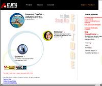
Now take a look at the next figure.
"I see what you mean, Vincent." The Atlantis site has not only copied the look of a very well known site, it has even "borrowed" some of the same graphics.
The Wayback Machine
There are times when you're visiting a site and you can swear it looks just like, say, the old IBM site but you can't be
sure. How can you go way back and find out how a site looked three redesigns ago? There's good news and bad news. The good news is there's a Web site called the Internet Archive Wayback Machine that's dedicated to preserving old Web sites. It's a nice trip down designer memory lane and it's also a way to possibly catch someone in the act of thievery.
The bad news is that many sites are missing and there are often missing elements on the page.
Go way back at the Wayback Machine web.archive.org/
Big Picture Issue #3 — Music Files, The Law, And You
You don't see Fortune 1000 corporations using music on their Web sites unless they've paid for the right to do so. In fact, if I were given one dollar for every Fortune 1000 site that used music (not counting media companies), I probably couldn't buy lunch.
I wish some small business sites and personal sites exercised the same discretion. Somehow, the people behind these sites believe there's no legal problem with putting the theme from "The Godfather" on a collection agency site. Why?
Because people just don't understand the copyright laws. Period. At best, people think it's OK to play a MIDI version of "Stairway to Heaven" but wrong to play the original Led Zeppelin recording.
In the Daily Sucker section of WebPagesThatSuck.com, I once discussed a marching band music company that was illegally using a music file ("Star Wars") on their site. This discussion caused someone "in the business" to send me an email explaining musical copyrights. Hopefully, after you read the explanation, you'll understand all the issues.
Working in copyright in a classical music publishing company for most of my adult life, I greatly enjoyed your Daily Sucker about the use of the Star Wars theme.
I track infringements on the Internet with some regularity. My company owns a couple of compositions that get infringed on all the time-most notably Carl Orff's "Carmina Burana." If you've seen any adventure movie trailer in the last ten years, you know the music. I just had the distinct pleasure of licensing its use in the trailer for the "South Park" movie!
From my 'insider' position, I can tell you that I think the reason people don't understand that the audio expression of music is something that can be 'owned' is because it isn't in a physical format, like the sheet music, or (as you so aptly pointed out) the recording.
My favorite way of explaining the concept of intellectual property to the illiterate tribesmen I encounter daily is "Okay, imagine that all the sheet music in the world burned up in a huge bonfire, and then imagine that they threw on all the CDs. You can still hum the music, right? The music still exists, right? Well, that thing you can't touch, or buy, or break...that is what we own."
Kids Today Don't Take Pride In Their Work
My old man loved saying “Kids today…,” and now I see why. Kids today don’t take pride in their work. When I was a young thug, I was taught not to leave any trace of my crime. Kids today are lazy. They just grab sites, change as little as possible, and figure the rest of the world is too stupid to notice.
Here are some examples of Kids Today:
- Don’t change the table dimensions—they use the same dimensions as the original.
- Keep the images from the old site and don’t even bother to modify their dimensions or change their names.
- Don’t even modify the HTML tags, especially those with the name of the other site, and any other information that would lead someone back to the original site. If the original site’s tags are all uppercase, at least change them to lowercase.
- Don’t bother to change the name of the style sheets they borrow, or they keep the same style sheet element name.
The simple way to look at the issue of using music on your site is this: If you didn't write it, you don't own it and can't put it on your site. In fact, even if you wrote a song, you may still not own it. John Fogerty was sued by his former record company for writing songs that sound like the Creedence Clearwater Revival songs he wrote years earlier, which the company owns. Hmm. And I thought the book business was tough.
Will some music copyright owner come after you if you use a sound file you shouldn't be using? Who knows? Why take the chance? The entertainment industry in general and the music industry in particular are very diligent about protecting their copyrights.
Finally, forget for a moment about the legalities of putting music on your Web site and just consider whether it's an effective strategy or a distraction. Nothing says "I'm an amateur, please make fun of me behind my back!" faster than using background music on your site. As always, there are exceptions: on a band site or a movie site, you're expected to put your songs on the site-but it would be most considerate of you if you didn't put them as background music.
Music on Your Web Site
No topic is "touchier" than music on a Web site. Here are a couple of important links that explain the ins and outs of what you can and can't legally do with music. Of course, none of this information should be put into practice without consulting an attorney. The rules on copyright vary from country to country.
"The Use of Music on a Multimedia Web Site" A very educational article phrased in terms that most people can easily understand. Full disclosure: I've used its author on a couple of contracts.
"Web Site FAQ" BMI is one of the leading licensors of music in the world, so it's their business to know what you can and can't do. My favorite quote about what's covered is their definition of a music page. "A music page is a web page with any links to audio, or multimedia files, that contain music. It can also be a page that has music playing upon the loading of the page."
"Copyright Basics" I just briefly touched on "borrowing" images but I haven't even touched on the issue of "borrowing" text from another site. Actually, that issue is much more complex because of the doctrine of "Fair Use." When you start to get involved in copyright issues, well, it's time for a lawyer.
Contracts
Get a lawyer. Anything else I’ve said earlier and now say and will say in the future about legal matters is not authoritative and shouldn’t be believed. Here are some links to articles on the topic, but they don’t take the place of a lawyer.
“Internet Library” Summaries of actual court cases. Not quite legalese, but tending in that direction.
“The Internet Law Journal” Another fairly complex site, but it has lots of depth. Temporarily unavailable.
The Link That's Worth the Price of the Book?
As you've seen, there are complicated legal issues revolving around one issue-copyright. You just know these aren't the only legal issues facing Web site designers and owners.
There are a whole host of legal issues that you have to go through to make sure you don't get your rear end sued off. This is especially true when you're dealing with the artists who create your graphics. If you don't have the outside design firm sign the right kind of contract, you may not own your own material. The best place to learn about these issues is Ivan Hoffman's Web Site Audit Check List.
Some of the topics covered are:
- The Need for a Written Web Design Agreement
- Who Owns the Copyright in Your Web Site?
- The Use of Protected Materials on Multimedia Web Sites
- Work Made for Hire Agreements
- Domain Names and Trademarks
- Disclaimers
Big Picture Issue #4 — Technical Concerns
Besides legal issues, there are technical issues that affect your Web site. You may think it’s easy for visitors to view your Web site—they just get on the Internet, type some characters, hit the Enter key, and they’re at your site. The process is actually a lot more complicated than you might imagine because there are so many technical issues involved. Some of these issues include the quality of the server where you host your site, the number of other domains hosted on that server, the software and utilities your host provides, and the size and number of the Internet connections of your hosting service.
Upgrade Your Browser or We'll Shoot This Monitor

Check the appearance of your site using different browsers on different systems.
I really can't put it any simpler than that. You would think that Web pages would look the same in each and every browser on each and every system. Well, they don't. Why? Because the Internet Explorer and Netscape (Communicator) browsers interpret HTML statements differently-and that's for statements they both support. Back in the days when Microsoft and Netscape were engaged in a life-and-death browser war, each vendor also created their own proprietary tags which, of course, were not supported by the other vendor.
A perfect example of the same Web page looking completely different in two browsers is shown in Figures 4.15 and 4.16. Obviously, somebody didn't check to see how their site looked using Communicator.
Connection Speed—If the Bits Don’t Flow, People Will Go
As you’ll discover in Chapter 10 “Grrraphics,” many sites don’t optimize their graphics to make the pages load faster. Optimizing the file size of your graphics is probably the most important thing you can do to help your page load faster. Why is that important? Zona Research estimates that fat Web pages—any pages that take longer than 8 seconds to download at 56K—cost businesses a lot of money: $362 million in 2000.
If you’re looking for more articles than you ever imagined existed on the topic of testing your Web site for speed and responsiveness, go to Keynote.
With apologies to the late Johnny Cochran, I like to say, “If the bits don’t flow, people will go.” Quickly loading Web sites are important because:
- As we learned last chapter, visitors want their problems solved now!
- Most people are not connecting to the Internet with high-speed modems.
- More and more international users are accessing the Web, and many don’t have high-speed connections.
- Just as the thin, athletic guy steals the girl from the fat guy, sites that load quickly will steal customers away from their bloated competitors.
- Sites that load quickly and conform to standards are easier to maintain and change, and they eat up less bandwidth—saving your company money.
Too many of us forget that when we design a site and then load it into our browser, it’s coming directly from our hard disk. We also forget that even when we test a live site, we probably are connecting to the Internet via a T1, cable modem, or DSL, which isn’t the best measure of real-world speed. How can we get an accurate representation of what people will see when they dial up using real-world equipment?
The obvious solution is to get a dial-up connection. But if you can’t justify the time and expense, there’s an easier way. Macromedia’s Dreamweaver tool—or just about any decent Web editor—will tell you the weight of the page. For example, when I see this display at the bottom of my screen:

it means Dreamweaver is telling me that the page is 236KB in size and will take 34 seconds to load at 56Kbs (the setting I chose). What’s nice about Dreamweaver is that you can set the speed of the connection to 14.4, 28.8, 33.6, 56, 65, 128, and 1500 kilobits per second—or you can type in another speed and see how long the page will take to load. I find the only problem is that this information resides down at the status bar, where it is easy to ignore.
Note: The rest of the chapter is about a product I no longer use.


