Biggest Mistakes in Web Design 1995-2015

I've gathered what I think are the biggest web design mistakes committed during the period 1995 to 2015. Yes, it is a little facetious to say these mistakes will be made in the year 2015, but it's human nature to repeat your mistakes over and over. But it's human nature to repeat your mistakes over and over <grin>.
I've added more material to the article—especially the sections on Contrast, Graphics, Flash, JavaScript and Text. I've added more videos and screenshots, including those of sites that have changed. I have proof of how bad they used to be.
Some mistakes I'll discuss aren't actually design mistakes in the classic sense—ugly graphics, bad navigation, etc.—but serious big picture problems.
1. Believing People Care About You And Your Website.

These women are laughing at you. Why? You designed your website for your needs, not theirs. It gets worse. After they stop laughing, they're going to one of your competitors' sites to buy something.
Here's an email I received about the topic:
Powerhouse is a UK electrical goods retail store. We knew they had a nice bread maker at an even nicer price, so (we) went to their website to see if we could buy it.
Because we use Firefox, we weren't allowed in. (Note: The site has disappeared. Did a Firefox-free environment cause this to happen? I don't know, but I'm sure you don't want to find out what happens if you keep potential customers out of your site. — vf)
Comet's website worked a treat and they have our money now! (Ironically they're gone, too, though I suspect not for web design reasons).
Write these two sentences where you can see them as you're working:
- The only reason my website exists is to solve my customers' problems.
- What problems does the page I'm looking at solve?
Nobody Cares About You Or Your Site.
Really. What visitors care about is solving their problems. Now. Most people visit a website to solve one or more of these four problems:
- They want/need information
- They want/need to make a purchase / donation.
- They want/need to be entertained.
- They want/need to be part of a community.
Too many organizations believe that a website is about opening a new marketing channel, getting donations, promote a brand, or increase company sales by 15%. No. It's about solving your customers' problems. Have I said that phrase enough?
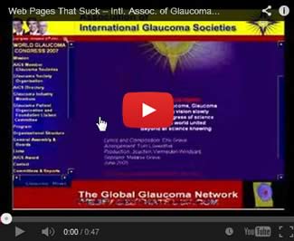
If there ever was a site that was not about meeting their customers' needs, it has to be the Association of International Glaucoma Societies. They've "fixed" the site, but here is a video catching them in the act. The YouTube version is below.
2. A Man From Mars Can't Figure Out What Your Website Is About In Less Than Four Seconds.

You should be able to look at the home page of any site and figure out what the site is about in less than four seconds. If you can't, the site is a failure. A current example of a site that would confuse a man from Mars is Genicap.
People who make Mistake #1 often end up making Mistake #2. An example of a site that fails the Four-Second Test is an older version of the Mars Hill site (shown below).

Is this an African sewing cooperative? Are they trying to sell us something? What is this site about? Who knows? Who is going to care enough to stay around and find out?
The name of the organization (Mars Hill) and the "tag line" (we are beginning a new season of covenant) tell you nothing. Non-profit organizations are the worst offenders when it comes to names and tag lines. Here's a typical non-profit organization's name and tag line:
Big Hands of Hope
– It's all about compassion
No. It's all about solving your visitors' problems. Nothing in the name or tag line tells you this organization helps African children.
Here's an over-the-top example of a name and tag line that's better:
Save the African Children
– We keep them from dying a horrible death
Yes, you must tone down the tag line, but at least you understand the mission of the organization.
3. Contrast, Dammit.
According to Wikipedia: "Contrast is the difference in visual properties that makes an object (or its representation in an image) distinguishable from other objects and the background." According to Vincent Flanders: "Without proper contrast, visitors to your site can't read the text and if they can't read it, they will leave it." Here's a website that explains the need for contrast — and it's done visually.
Of all the 16 mistakes, this one is the most mystifying. How is it possible not to notice you can't read the text on a page?
The image below is a piece of the menu on one of the subpages at Tampax.com. If you click the image, you'll see a full-size version. (The file was saved at 99%, so there's no loss in quality.)

Can you read it? Not really.
Harmony Central had an excellent forum entry called Why Do Web Designers use Light Gray Type on a White Background? The second comment (by "Slight Return") hits the nail on the head—designers know their content so they can read it even if they can't really see it.
Many otherwise excellent web designers fall victim to Gray, Light, and Bad Type or "GLBT." One site, that will remain somewhat anonymous, had an article about an interesting use of PHP (he's a programmer, not a web designer). Right away, I knew I was looking at a GLBT site.
Click the image below to see what I saw.

I ran the page through AccessColor and, if you click the image below, you'll see how badly the site failed to have sufficient contrast.

73.93% of the text fails to meet one of the contrast standards.
More Bad Contrast
Another example of bad contrast comes from The Wedding Lens (click picture for original size image).

Do you see the problem? If not, maybe this screen shot will help. If not, maybe a screenshot of the online Colour Contrast Analyser's results will help.
Learn About Contrast
There's no excuse for contrast problems. If you won't take my word for it, take Alistapart's. Between the two of us, you've got the omega and alpha of web design telling you to wo/man up and make your site readable. If you further doubt the importance of contrast, visit Contrast Rebellion.
For the final word, here's a very good article.

4. Using Web Design Elements That Get In The Way Of The Sale.

Would you do this?
You're a fundraiser getting ready to make the ask for a large sum of money. You're the best fundraiser on the planet because you have a pitch that can move the heavens.
You walk into the donor's office, introduce yourself and place an information packet in front of the donor.
As you start to make your big pitch, the donor reaches into the packet, extracts the pledge form you hope he'll sign and grabs a pen.
As the donor starts to sign the lucrative, long-term pledge you reach over across the table, grab the donor by the throat and yell. “Not so fast, jerkface! I haven't finished my pitch!!!”
You wouldn't do that, would you? Then why are you using design techniques that keep the visitor from getting to the sale? These design techniques are the web equivalent of grabbing someone by the throat because they violate the golden rule of doing business on the Web — "Don't do anything that gets in the way of the sale."
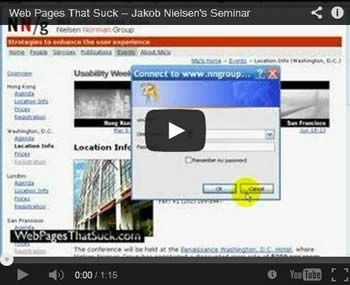
Here's an example of getting in the way of the sale — literally — as performed by Jakob Nielsen. Well, somebody at the Nielsen Norman Group. As the person who sent this mistake in to me said in his email:
So I get this link on a newsletter that informs me that Dr. Nielsen will be holding usability conferences around the globe - one in a city only a few hours drive from where I live. Clicking the link that's 2/3rds the way down the newsletter, I find myself on a nice, concise and easy to navigate page that provided me with all the information I need.
Sold on the idea of attending, I see and click one of the links on the left column menu under each conference city entitled "Registration" for the locale of my desire - only to find that I can't register.
When you click on the link, you're given the ubiquitous basic authentication username and password dialog with no instructions on how to enter said page. They want me to register for their conference, but they've thrown down a frustrating step into the process that forces a user to come back some other day.
I suspect this occurred by not testing all the links on a machine that wasn't already authenticated. Even if this encumbrance occurs for some other reason, it's not the best way to show one's expertise in the area of usability.
Some of the many, many other techniques that get in the way of the sale: Splash Pages, FlashSplash Pages (Video), animations, lack of focal point on the page, too much text, too little text, too many pictures, etc. See any of my books or any article on this site for more examples.
When people arrive at your site, it's because they've made a commitment. They've clicked a link or an ad and now they are at your site so you don't have to try to seduce them. Let them in your site.
On the other hand, seduction is necessary when you buy ads on other sites and search engines. You have to seduce people before they click.
5a. "My (Blog / Website / Facebook Fan Page / Twitter Account) Is Everything."
I was hanging out at a non-web design conference and two of my friends sat down and wanted to talk about their websites. One of them kept loudly saying, "My blog is everything" until he got tired of me trying to tell him otherwise.
It's possible that his blog "is everything," but you can only make that statement when you've tried a website, Facebook fan page, Twitter account, and whatever other marketing activities are appropriate. For all I know, his "everything" might actually be Google ads and a simple landing page. Believing there's only one, true path is dangerous.
5b. Thinking your website is your marketing strategy.
Unless you're an online shop selling t-shirts, cameras — you get the picture — your website is not your marketing strategy. Your website is part of your marketing strategy.
If you take orders over the phone, don't get rid of your phone banks. If you're successfully using direct mail, don't stop. Heck, if the Yellow Pages are working for you, continue to use them. The hard part, is to find where your website fits in your marketing strategy.
Here's an email I received from a dear friend who was consulting for an organization that was going to put all of its eggs into one web basket:
I have to tell you that I attended a board meeting today for the organization whose website you checked out for me.
The board consists of high-end people who had flown in from all over the country! When push came to shove, they asked me what I thought about their ability to raise money by driving people to the website.
I shared your response with them. Silence in the room. And then a couple of other board members acknowledged that it needed work, affirming that they had the same impression but didn't have the expertise to say anything..
You can't put all your eggs in one electronic basket.
6. Have You Ever Seen Another Website? Really? Doesn't Look Like It.

I usually don't let bad design affect me, but there's one mistake that really gets under my skin. I don't understand how it's possible to create web sites that look like car wrecks on the information highway.
Sites like Accept Jesus, Forever Forgiven puzzle me. Hasn't anyone at this organization seen another web site? Have they been to Amazon.com or the ASPCA or even to Catholic.net (which sucks, but is infinitely better than AJFF)?
I have a selection of these types of sites in an article called Over-the-top Websites.
7. Navigational Failure.
All web navigation must answer these questions:

Where am I?
Where have I been?
Where can I go next?
Where's the Home Page?
Where's the Home Home Page?
Navigation must be simple and consistent.
Common mistakes include different types of navigation on the same site, a link to the current page on the current page (home page link on home page), poorly worded links so the visitor doesn't know where he'll go if he clicks, no links back to the home page and confusing links to the home page.
A problem that isn't discussed much is the order of the navigational items. Many sites set the link order based on their needs. In this example, the links make sense to this organization (Home, About Us) and they believe the graphics give a down-home feel. If the links were based on their users needs, the links would have a different order and the pictures would be replaced with something more helpful.
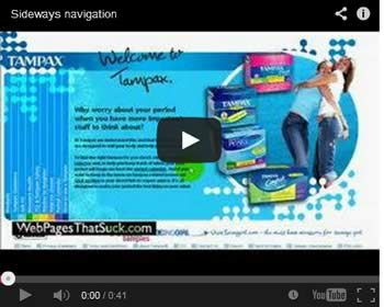
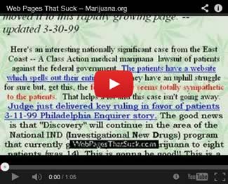
There are millions of ways to screw up navigation. This video of the Tampax web site shows you one unusual way to screw up navigation.
8. Using Mystery Meat Navigation.
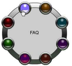
While there are 10 million ways to screw up your navigation, the best way to screw it up is to use Mystery Meat Navigation (MMN). Here's my definition:
Mystery Meat Navigation occurs when, in order to find specific pages in a site, the user must mouse over unmarked navigational "buttons" — graphics that are usually blank or don't describe their function. JavaScript code then reveals what the real purpose of the button is and where it leads.
Wikipedia used to have a great definition of MMN:
Mystery meat navigation (also abbreviated MMN) is a term coined and popularized by author, web designer, and usability analyst Vincent Flanders to describe user interfaces (especially in web sites) in which it is inordinately difficult for users to discern the destinations of navigational hyperlinks—or, in severe cases, even to determine where the hyperlinks are. The typical form of MMN is represented by menus composed of unrevealing icons that are replaced with explicative text only when the mouse cursor hovers over them.
Flanders adopted the epithet mystery meat because, like the unidentifiable processed meat products historically served in many American public school cafeterias, MMN is unfathomable to the casual observer. Before conceiving the term mystery meat navigation, Flanders temporarily described the phenomenon as Saturnic navigation, a phrase named for the Saturn Corporation, whose web site formerly served as a high-profile example of this web usability problem.
Certain types of sites are allowed to use MMN: music, band, movie, art, experimental, fashion — sites where making an impression or being cool is mandatory.
Another exception is what I would call "cult sites" — sites that are so popular with a specific group that their audience automatically commits the icons to memory. The old version of Slashdot immediately comes to mind. The stupid Path app interface is another example.
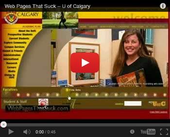
The problem with MMN is it influences designers and companies who aren't smart enough to realize they're not in the music, art, movie, or fashion business. When a manufacturing company (video) starts using MMN, you know the apocalypse can't be too far off. The University of Calgary used MMN for unknown reasons. Of course, they changed their site — improving it in the process, but they can't hide their crimes. The video below shows you what the University of Calgary looked like when it used MMN.
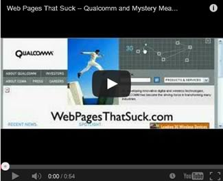
It's not just small companies and universities that suddenly become brain damaged. Big corporations also act like lemmings. The example below is from an older version of Qualcomm. Yes, that Qualcomm. You know, the company with a market cap of 113 billion dollars.
9. Your Website Lacks Heroin Content.

In his classic book Naked Lunch, which I read when I was 15, William Burroughs described heroin as the ultimate product. Why? Because people would crawl through the sewers and beg to buy it. In the non-drug world, there are very few products that can be classified as having heroin's appeal.
How many web sites have Heroin Content?
Heroin Content's characteristics vary by type of site — but you'll know it when you see it. One global characteristic, though, is frequently updated content. The best way to get people to come back to your site again and again is by having content they need, and then updating this content on a regular basis.
How do you create Heroin Content? The answer depends on the likes and dislikes of your audience. Remember, it's what your audience wants that counts. What I consider Heroin Content is somebody else's Quinine Content.
Here are some thoughts about web content.
- Does your content solve your customers' problems or does it create problems?
- Does your content match your audience's expectations?
- Have you determined the purpose of your site?
- Do you know your target audience?
- Ask yourself: "What content do I have that would cause anybody in their right mind to visit my site a second, third, or fourth time?" This is extremely important. You might con (seduce) someone to visit your site once, but why would they want to come back a second, third, or fourth time? If you can't answer this question, you really shouldn't have a web site.
- Is the content technically correct?
- Does your customer need to know the content you're presenting?
- Is the content current and updated frequently?
- Can people find the content they're looking for?
- Does my site have Heroin Content?
I just got through reading that Bill Gates wants to start a blog. Why would anyone in their right mind want to read it? Do you think it will contain Heroin Content? As Seth Godin brilliantly points out, blogs only work when they meet four of the following five conditions:
- Candor
- Urgency
- Timeliness
- Pithiness
- Controversy
Content Trumps Design. PostSecret is poorly designed. You have purple links on a black background, small text that doesn't contrast well with the background, lime green headers, a page that goes on and on, content that only changes once a week and a poorly designed logo. The postcards are often hard-to-read, especially on a small monitor.
The content, however, is extraordinary and ever since I discovered the site, I've visited it every week. Well, every week but the week I had brain surgery <painful grin>. This site is proof that content is much more important than design. Yes, my comments about the design are accurate, but meaningless because the site has Heroin Content.
Before you start saying, "My site also has Heroin Content so I don't have to worry about the design," let me point out a small fact. Your site doesn't have Heroin Content. Digg.com has it, YouTube borrows a lot of it, and Google is another site that has Heroin Content.
10. Forgetting The Purpose Of Text.

After ten years, you'd think web designers would understand how to use text, but they don't. Here are some helpful hints.
Text is Text. Don't use graphics or Flash for text. The first reason is it increases the size of the page; the second reason is it isn't search engine friendly; the third reason is the graphics are often of poor quality and are aliased (jaggy); and fourth, mistakes are hard to correct as this example demonstrates (it was originally created in Flash).
Gimme contrast. Web designers have fallen in love with creating text that doesn't contrast with the background.
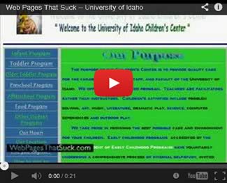
One of the strangest set of text contrasts I've ever seen was at the University of Idaho Children's Center (it's been fixed), with blue and black text on a green background. It certainly hurt the eyes. They also alternated the color of their links — now that's a bad design technique you've probably never seen before.
As I said, they fixed their page, but the video below shows you the bad version.
If you're not sure about the contrast between the text and background at your site, check out your text contrast at JuicyStudio or AccessColor.
Don't use small text. Designers are also fond of using small text (especially on Flash sites). Hey, we're all getting older and as I often say, "If people can't see it, they will flee it." Here's an architectural firm that uses small graphics as text (as saved by Archive.org).
Keep text simple. The next video explains this concept better than I can.
Text Mistakes
There are lots of ways to misuse text on your website. The following checklist lists some of the different ways. Oh. If you check any of the items…well, you know what it means.
11. Too Much Material On One Page.

Yes, it's called a web page, but that doesn't mean you have to cram all your material on one page — just like this page does <grin>.
It's very easy to keep adding material to your home page until it gets out of control.
With so much content vying for attention, it’s difficult for the eyes to find the focal point. People get confused and they leave. A long web page means you have failed to organize your site properly — probably a combination of not planning your site and poor navigation. An example of too much material on one page is Arngren.net.
Oh. Yes, this page is too long. You're learning good web design by looking at bad web design.
12. Confusing Web Design With A Magic Trick.

Web design is the reverse of a magic trick. In a magic trick, you show the audience your right hand and perform the trick with your left. In Web design, you tell them where you’re going first—and then go there. People have expectations about web sites and they don't like surprises. It will certainly confuse them and it could make them want to leave and find a site that's less confusing.
If you're a dentist, your visitors expect your web site to look like it belongs to a dentist — not to someone who is going to the opera.
Speaking of magic tricks, links should be clearly labeled so your visitors won't be surprised when they click. I made a mistake of not labeling a link on one of my pages and I received the following email:
Because I use your site for design considerations, I access your site at work. You probably know where I'm going with this, but…it might not be a bad idea to warn folks when the content is going to be "racy."
Don't get me wrong, Sports Illustrated's swimsuit issue is tame (and in my view, the models are gorgeous), but some of us work in an environment of hyper-sensitivity! It would be nice to know when my PC is going to be non-PC so I can at least glance over my shoulder. (I know I could look at the address on the status bar to get a clue, but…)
Here's a link to what he thought was racy.
If you use a vague link description, or just say "Click Here" and don't tell people where they'll end up, they could be horribly surprised (and/or shocked and/or disgusted) when they click the link.
13. Misusing Flash.

Just as a raincoat is a tool that can be used for good or evil purposes, Adobe Flash can also be used for good or evil. It all comes down to how it's used and who is using it.
Unfortunately, there's a tendency to misuse Flash and because of space I can't go into every detail. Here's a typical scenario:
You have to watch a boring, soundless, twenty second flash introduction with no option to skip it. If you're still around when the content loads, the pain doesn't stop. There is a lovely eight or ten second delay between when you click one of the navigation options and when the content actually arrives.
Hugh MacLeod brilliantly sums up everything that I feel is wrong with Flash in one simple cartoon that is Not Suitable For Most Workplaces.
Annoying Flash Techniques I Have Witnessed
- Forgetting to put a “Skip Intro” button, forcing visitors to see your stupid FlashSplash page every time they visit. The problem could be “solved” by setting a cookie so visitors only see the animation once unless they click a button to “play it again, Sam.”
- Putting a “Skip Intro” button on the page. Of course, we all realize that a “Skip Intro” button signifies that the content on the page is worthless. Good Web designers only put content that must be viewed on a page. By giving them the option to skip this material, you're saying it's not worth seeing. If it isn't worth seeing, why do you have it on your site in the first place?
No, I'm not trying to have it both ways. An introductory Flash animation is a Splash page. Splash pages, as we learned long, long ago, are not necessary. If you must have a “Skip Intro” button, make it big enough so people can see it and have it available as soon as the animation starts. Don't wait ten seconds to load the button. Here's a useful Flash video about Skip Intro. - Making people listen to music. If you have (original) music in your Flash animation, give people the option to turn off the music.
And if people turn the off the music on one page, it means they don't want to hear it on any other page. There are dozens of sites where the programmer hasn't figured out how to make the music stop on all pages. They have a “Stop the Music” button on each page. Arrgh!!! A good example that may not be work appropriate (I warned you) is a fashion site where if you turn off the music on the FlashSplash page and click "Enter", the music automatically comes back on. The designer should be whipped (unless s/he likes to be whipped).
- Creating a “non-Flash” version of a site that still includes some Flash animation. If you have an HTML version of your Flash site, make sure there's no Flash. There are few things more stupid than using Flash in a non-Flash Web site.
- Using Mystery Meat Navigation with Flash—taking one bad technique and making it four times worse.
Proper Uses of Flash I Have Witnessed
There are many sites who understand how Flash should be used. The New York Times brilliantly used Flash and MMN (may be the only brilliant use of MMN) on their feature "A Look at 1,000 Who Died" (registration is free, but required).
You can view the casualty list by last name, branch, date of death, home town, home state, gender, age, type of death, and "other." On the "Other" page, they could use some contrast. Black type on brown background is hard to read.
Here's another great use of Flash. Once again, it's from the New York Times:
Budget Puzzle: You Fix the Budget
Today, you’re in charge of the nation’s finances. Some of your options have more short-term savings and some have more long-term savings. When you have closed the budget gaps for both 2015 and 2030, you are done.
When Flash works, the results are powerful.
Flash Today
I've been against Flash before it was cool, but my complaints are about using it inappropriately. Today there is an ethnic cleansing-like movement to eliminate Flash from the face of the earth and the movement's leader was Apple's Steve Jobs. There are many technical issues with Flash like overheating CPUs, but the biggest force against Flash is HTML 5 and the web standards people who hate everything proprietary unless it comes from Apple. Going Straight: How To Ditch Flash and Embrace the Future of the Web has links to a lot of the background about Flash's weaknesses as well as tips on how to go Flash-free.
14. Misunderstanding The Use Of Graphics

Graphic mistakes make the list because they keep showing up again and again.
Like Flash, there are so many ways to misuse graphics. I'm amazed by the number of sites with ugly graphics and the number that still use animated GIFs.
Speaking of animated GIFs, I think the winner of the "Holy Mother of God Can We Cram More Animated GIFs On A Web Page?" is the Haiti News Network or American Beauty Border Collies.
Graphical Misuse / Misunderstandings
There are only about a trillion ways to misuse graphics and images on your website. The following checklist lists some of the ways you can misuse graphics. Oh. If you check any of the items…well, you know what it means.
15. Mystical belief in the power of web standards, usability, tableless CSS and HTML 5.

There is nothing wrong with Web Standards, usability, tableless CSS and HTML 5 except they're being touted by…guess who?…people who offer web design services specializing in…guess what?…Web Standards, usability, tableless CSS and HTML 5.
These are simply tools. Remember, nobody gets excited about the tools used to build a house ("Please tell me what brand of hammers you used!"). People get excited about how the house looks and performs.
Yes, Web Standards can make your site search engine friendlier, reduce bandwidth, etc.
The article 9 Ways to Misunderstand Web Standards provides interesting insights into the problem. Speaking of problems, the text doesn't show up in IE6 (could also occur because of ad-blocking software I'm using). Works fine in Firefox. Hmm.
16. JavaScript

This is the most controversial of my selections because JavaScript is more often used for good than evil.
The Number One problem with JS is security. Many of the browser exploits— especially with Internet Explorer— can be traced to JavaScript. Microsoft's solution to many security holes is to "turn off scripting" (JavaScript).
The second problem is JS bloats up your page. My home page goes from 31,803 bytes to 71,488 because of the JavaScript I've added to track visitors to my page and what they do. Then, there's the issue of all those ads on this site. They're run by JS. No ads, no money. The benefits make JavaScript so wonderful, but there's a cost. I know, I know. I'm getting a lot of benefit out of JS, which brings me to problem three.
The third problem is that JavaScript, until recently, has been a browser resource hog that page take longer to load. Fortunately, all the browser makers are making inroads on rewriting their JavaScript engines. Microsoft rewrote, Firefox rewrote their engine, Google rewrote their JS engine, as well as Opera and Safari.
On the other hand, when it comes to apps — and mobile apps are the future — JavaScript sucks because they tend to make the apps run slow, The article Why mobile web apps are slow is incredibly important in our attempts to understand the issues with JavaScript.
The fourth problem is all the widgets in use today. All these widgets use JavaScript and most of these widgets are poorly written and cause delays in loading web pages.
The fifth problem comes from JS conflict. So many JS programs say they want to be the last item before the BODY tag. Who wins? Does it make a difference? Then there's the problem of other JS programs in the HEAD of the page. Most of us don't write JS so we copy and paste elements from scripting sites. I have had conflicts and it takes forever to find the problem when you're not the programmer.


