Worst Web Sites of 2008: Navigation #6-10

A navigational system that's easy to understand has to answer four questions.
1. Where am I? Your visitors should always know where they are in your site and how this location relates to the home page. It's their point of reference.
2. Where have I been? Yes, graphic links are popular, but you can't look at a button that says, “About This Site” and know whether you've clicked it before or not. You have to rely on your memory. One reason for using text links is that if you've set them up correctly, they change color once a user clicks them — a nice visual cue that most Web users are familiar with.
3. Where can I go next? Your navigation scheme should let people know how to get to the important content on your site.
4. How do I get back to the Home page? There should always be a link to the home page on every page but the home page itself. It never hurts to simply label the link “Home.” You shouldn't try to be cute when you name your labels.
The following sites don't understand navigation
Nobody is perfect. These web sites prove it.
6. Saman Zerin
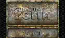
It's one of the first web designs where I didn't actually have a clue what I was supposed to do. Not even a hint. And even when you work it out, the site is still unusable. It seems to link you to a random page depending on what you click.
Vincent Flanders' comments: I'm not ashamed to admit that I cry every time the Pedigree commercial "A Dog Named Echo" comes on my TV set. This site makes me want to cry — but in despair.
Since it's a web site for a magician, Mystery Meat Navigation almost makes sense except for the fact that you want people to find your content. It took a while for me to find the navigation. Before I found the navigation, I somehow closed the "door" to the site and got a message that the site wanted to close the window.
The screeching sound that's made when the pages move is horrifyingly annoying. It's almost like hearing fingernails scratching a chalkboard. The site also shows one of the perils of translation. There's one page that says:
Not really accurate English.
A new site is under construction.
7. BEA — The Beginning of Business

NOTE: The site has been "fixed." They can run, but they can't hide. I'll be putting a video up Real Soon Now.
Here’s an article about this incredibly sucky site from a major company. The site is called BEA — The Beginning of Business. I think a more accurate tagline is "The Beginning of Bad Web Design."
Note to the author of the article: Nobody’s more surprised than I am that WebPagesThatSuck is still here. I didn’t plan for it to last thirteen weeks — much less thirteen years. On the other hand, I should have known it would go on because there’s a limited amount of good web design and an infinite amount of bad web design on the web.
8. Stupid Fun Club

I can't tell if there is even anything worthwhile on this site. The show "Modern Marvels" on History Channel was showing these guys developing all kinds of fascinating gadgets. Their group is called "Stupid Fun Club," in Berkeley, CA. Google provides a physical address and phone, so I may call them to get info... 'cuz the web site is useless!
9. Petrosains

My first problem is the message under the "HOW TO NAVIGATE" heading that says, "Click anywhere. Drag and Release." OK. That's what I do and guess what? Nothing happens. I look around and finally see the {ENTER} button. I click, drag, and release and it just moves planets around. I mouse over some of the planets and get scientific trivia. Other planets are incredibly bizarre MMN and open up other pages like "Contact."
I'm sure somebody likes it, but it's a waste of time.
10. CUH2A

Working with most architects, their web sites are considered well-designed compared to working with their unbearable egos. Even so, you can't discuss design in any shape or manner with them.
Here's but yet another bad design by an architectural firm.
Vincent Flanders' comments: God bless architects' pointy little heads. When it comes to web design, their industry is truly one that sucks.
You just know those circles are Mystery Meat Navigation. You just know it. Of course they are. Granted, they have a real menu at the top that suffers from poor contrast, but clicking on a link of this Flash menu brings up a whole bunch of other links that have even less contrast.
Clicking on submenu links doesn't give you consistent results. You may get new links that are Mystery Meat, or a new set of "regular links," or you may get content. I'm hoping this firm doesn't use this type of navigation in the buildings they design or like Theseus in the labyrinth of the Minotaur, you'll need a ball of string to find your way back (I've got to find some way to use my degree in Classics).
What in the hell does their name mean? C'mon, CUH2A? Besides being pretentious (it would be like calling myself "FLANman"), they're wasting the TITLE tag's importance in search engine optimization.


