The Worst Web Page In The World (page 2)
Web design is an art. Great web design occurs when design and content are seamless and you don't notice its greatness. With great web design, it's easy to find the information you need. The content makes you want to return again and again and, most importantly, great design gives credibility to the company/organization.
Obviously, the sites that follow aren't examples of great web design.
Tally-Ho Uniforms & Accessories

Why this site is included is obvious to everyone but the site owners. But it's always that way.
Submitter's comments: Pretty bad site. Trailing cursor, distracting background, animated GIFs, and ugly color: What more can you say?
Usability Net
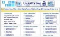
There's a phrase called "unclear on the concept" that applies to this site. Flash navigation has usability issues and you would think a web site about the topic of usability would understand this fact.
HRODC
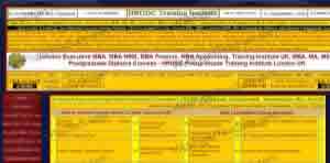
Click image for full size screenshot of original site. (16Mb)
We've got small text, scrolling text, low-contrast text, long pages, animations, and it's over 1Mb in size with plenty of bad design errors like 164 images and 290Kb of Javascript and 73 scripts. Actually, the home page is 1,147,386 bytes. WTF!
They've changed it slightly. Instead of having everything on one page, they created 66 categories and moved all the material to those pages. Can you imagine how big the original page was? Oh, it still sucks.
Zune Journey
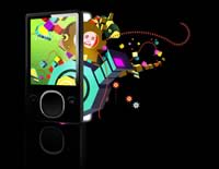
One person who commented on the site brought up an interesting problem: "How many computers today have the latest version of Flash? I am not allowed to install software at work."
The Zune site is Crap on a Plate — “purty” but it's still crap. Yes, I know, it should be forgiven because it's not trying to make money (if you don't believe me, ask Microsoft how much profit they've made on Zune), but c'mon. I never want to see another “Click and Hold” message as long as I live.
Etsy.com (select by color)
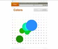
Ignorance is bliss because the downside of knowledge is pain. This site is very painful.
As someone commented: "Maybe I'm dumb or old (33 is old? dunno) or both but I have NO idea how to use this site... and when I click on things, what am I doing with them? where do they go when I "throw" them? The site made me feel like it was someone's inside joke and I clearly wasn't "in" on it. Sucky suckage of sucking suckiness."
Submitter's comments: I recently found your web site and have used your tips frequently in revamping our company's web site The downside is now I can really see how bad some web sites are.
Enjoy this rainbow colored mystery meat. It took me a bit to figure it out — play with the colors a bit, then click. It'll bring up a random (I think random) item of that color. Click on it again to maximize. If you wait a moment it'll tell you that you can "Throw" the items around.
It's sort of like a Flash lava lamp.
Vincent's comments: Etsy's home page has normal ways to find handmade items to buy. Just look at "Categories" and all the sub-categories listed underneath. Gee, it's logical. Then you have "Colors," which is the page that was submitted, and it makes no sense at all. Equally weird is "Time Machine" and "Connections." Connections seems to be a random person's Mystery Meat-based wish list. Why I would want to buy items for a random person escapes me. Most of the site escapes me.
Adobe Creative Mind
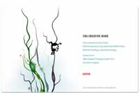
Just because you're the People's Voice Winner in the category of BEST USE OF ANIMATION OR MOTION GRAPHICS at the 2007 Webbys doesn't mean you aren't the leading contender for Worst Web Site of 2007 at Web Pages That Suck.
This site was the leading contender for the worst navigation site for the longest time. But one of my favorite quotes is, "It can always get worse."
Bow-Wow Books

This is just terrible. There is cute and then there is "too cute for your own good." The version for children is beyond terrible because nothing is there. With the adult section, which you can't really identify as such, there's at least a couple of pages of explanatory text.
The most important page is the one I clicked last. Their dog should bite them on the ankle.
Kafana Final Pok
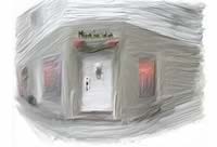
We have a bit of Mystery Meat Navigation on the 490Kb Splash page. You have to click on the door handle to go inside (this is so incredibly stupid) where you are greeted with 63 images who take up roughly 1.4Mb of bandwidth.
The page that was submitted to me was the Menu Page. I'm not providing a link because it's an 8.3Mb animated GIF image and I don't want to eat up any more of their bandwidth than necessary. Recently, I had another site using the page curl technique which I haven't seen in years. I guess bad web design goes in cycles. I'd like to trade a bad web design cycle for a Harley.


