

What I’ve Learned So Far From Using Heat Maps
January 28th, 2008 4:04 pm by Vincent Flanders
(Once again, I apologize for the Daily Sucker icon appearing.)
A heat map is an important tool because it shows you where and on what your visitors click on a particular page. It’s not the only tool you should use, but it’s helpful in spotting trends and possible areas of confusion for your visitors. Online heat map services used to be expensive, but the prices have dropped to the level of If-You-Don’t-Use-Them-You’re-Stupid. I’ve been using Crazy Egg and it’s quite interesting.
So far, here is what I’ve learned from using heat maps:
1. If you have a graphic near your content, somebody will click the graphic.
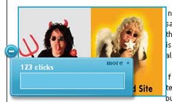 This graphic from the home page is problematic. As you see, 123 folks thought this graphic was a link. It’s not and I’ve now frustrated 123 visitors.
The graphic is a problem because it isn’t tied to a particular article on the site. I’ve tried getting rid of it, but the page seems empty without it.
I suspect what I need to do is change the graphic to something that isn’t so “clickable.”
I assumed people wouldn’t click, but they did click. I immediately went to the other graphics on the page and made them links. That was worth the price of the service.
2. Everything in life is a trade-off, but Javascript sucks.
Holy Mother of God I hate Javascript. You wouldn’t know it by how much of it is on my pages, but heat maps, analytic software, and those cute little Javascript accordion menus demand you use them. Not only does Javascript bloat your page (one of my pages has 75.51Kb of Javascript), there are possible conflicts between the different programs.
There seems to be conflicts between my accordion-style menus (which I’m using less and less even though they cut down on page length) and the heat map software. Clicks aren’t showing up and I don’t know who’s responsible for the conflict — the Javascript menu code or the Javascript heat map code. If you search Google for [javascript conflicts] you’ll get 455,000 results. I have bug reports in.
I think it’s safe to say you can’t go wrong by usling as little Javascript as you can.
3. Page folds aren’t important if you have content people want.
I’ll discuss this at a later time. Basically, people will scroll if there’s something worth seeing.
4. Menus are the new “page folds.”
I’ll discuss this at a later time.
5. Menus may be less important that you think.
I’ll discuss this at a later time.
Posted in Daily Sucker, Web Design |