
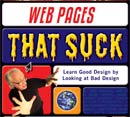
Does Your Web Site Use Bad Web Design Techniques?
Learn from the mistakes of FedEx, Brown University, The Pope, Microsoft, Qualcomm, Adobe, Apple, Harvard Business Review, Tom Peters, Saturn Auto, Memorex, Minolta, Saab, Intel, Chevrolet, Swatch, Canon, and thousands of other sites featured here for using bad web design techniques.
Fast Company magazine calls WPTS the "Best for Improving Your Site's Look and Feel."
"One of the best ways to learn is by example. Here's a site, produced by a pair of graphic-designer professionals, that shows you what not to do."
 The Worst Web Design Techniques Featured on Web Pages That Suck in 2005
The wait is over. Here's a rundown of what really sucked on Web Pages That Suck last year. Does your site use any of these design techniques. Not everything is a car wreck — that's too easy. Oh, and of course, WPTS made the list. Worst Web Design Techniques Featured on Web Pages That Suck in 2005
 The Daily Sucker: Real Sites Using Bad Web Design Techniques
The Daily Sucker features current examples of sites that have accessibility, usability, and regular design problems — including ugliness.
When I wrote my books, I thought I had covered every sucky design technique. Unfortunately, people are very clever and invent new ways to suck up their sites. I also feature sites that continue to make the same mistakes over and over. What's New in Bad Design — The Daily Sucker.
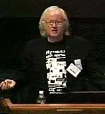
Speeches / Videos
Looking for a speaker who will entertain while educating your audience?
The videos are from speeches I've given and show you one of the worst examples of navigation, what would happen if an insurance company designed their site like a musician's site, and offers proof that web design and drugs don't mix. Speeches / Videos
 Mystery Meat Navigation
If you have to mouse over a graphic to discover whether it's a link and where the link will take you, then you have what I call "Mystery Meat Navigation." This evil form of navigation has moved from trendy design sites to the corporate world and it must be stopped because it violates the first rule of navigation: clearly show people where to go. The Mystery Meat article contains lots of examples of sucky sites.

Original Web Pages That Suck circa 1996-1998
This is what originally made WPTS famous. The material is mostly from 1996 to 1998, but the topics are, for the most part, still valid.
About Web Pages That Suck
I started this site back in July 1996 so I wouldn't have to teach a class on web design. Since I'm one of those extremely clever marketing folks, I chose a name that had marketing appeal and was edgy for the time. I could have more accurately called the site "Web Pages That Have Problems," but nobody would remember and it's boring. I'm not boring. Check out my speech videos.
My goal is to help you design effective and aesthetically pleasing web pages. My method is to show you bad design techniques so you'll realize what they are and not use them.